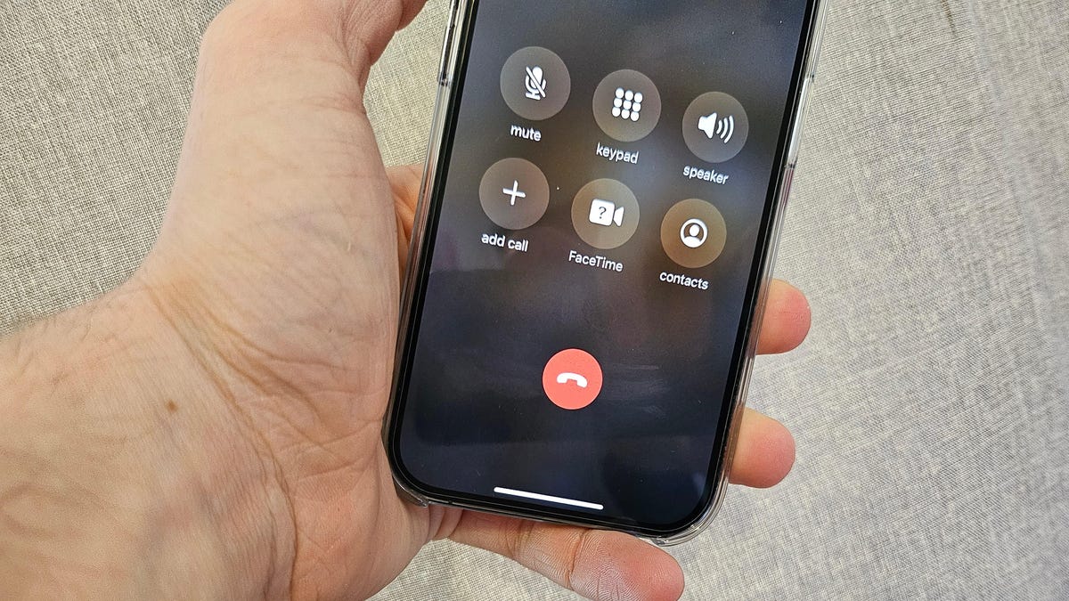
This world will never be the same: Apple has changed the location of the end call button in iOS 17

Apple continues to release beta versions of the operating system iOS 17. Having carefully studied the new features, journalists found an interesting innovation related to the interface of the phone call menu.
Here's What's New About It
So, Apple has changed the location of the control buttons and most importantly - moved the red end call button. If previously it was located separately from the rest, in the centre at the bottom, now the button "moved" to the bottom right corner.
In addition, all the buttons have moved downwards. Apparently, this is done so that the menu does not overlap the image - a photo of the person you are talking to.


Before/after
It seems that the changes are not so drastic, but for many people it can be a problem. After all, over the years, users have developed muscle memory, so most will probably inertia to press the former location of the button. Only now it won't be to end a call, but to activate FaceTime.
That said, there's always a chance that the updated interface is still only being tested and won't make it into the final version of iOS 17. It, by the way, is expected in autumn, along with the release of iPhone 15 smartphones.
Source: The Verge