Samsung explains the design ideas that shaped One UI 4

Samsung offers a rare glimpse behind the scenes into how One UI 4.0 was designed. The interface had to be simple, intuitive and secure while still allowing users to express their feelings.
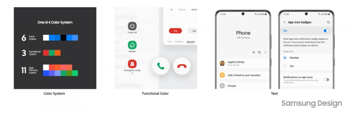
Version 4 starts out with a color system that was focused on cleaning up the look. The most essential elements are colored, and everything else remains monochrome. There are three types of colors in the system: app, core and functional colors.
Before One UI 4.0, the interfaced used slightly different colors to mean the same thing. Version 4 unified them in a consistent manner to create the functional colors, e.g. red means “stop”, “reject”, “delete”, “remove” and so on.
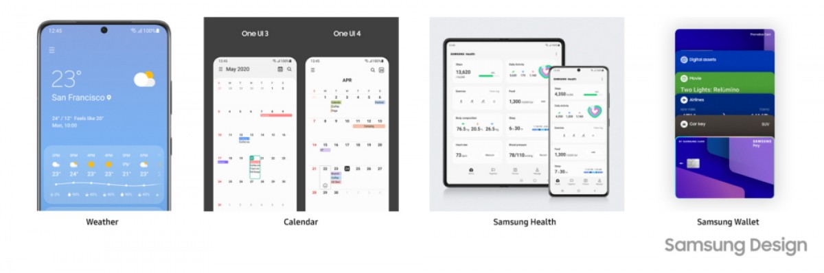
The team considered redesigning One apps in order to meet the different needs of users. This was the guiding idea behind the redesign of the Weather and Calendar apps, for example. Users want the latest weather information, while others are interested in the forecast for the entire day. Previously, that information was mixed together, but was split into separate views for the latest Samsung UX.
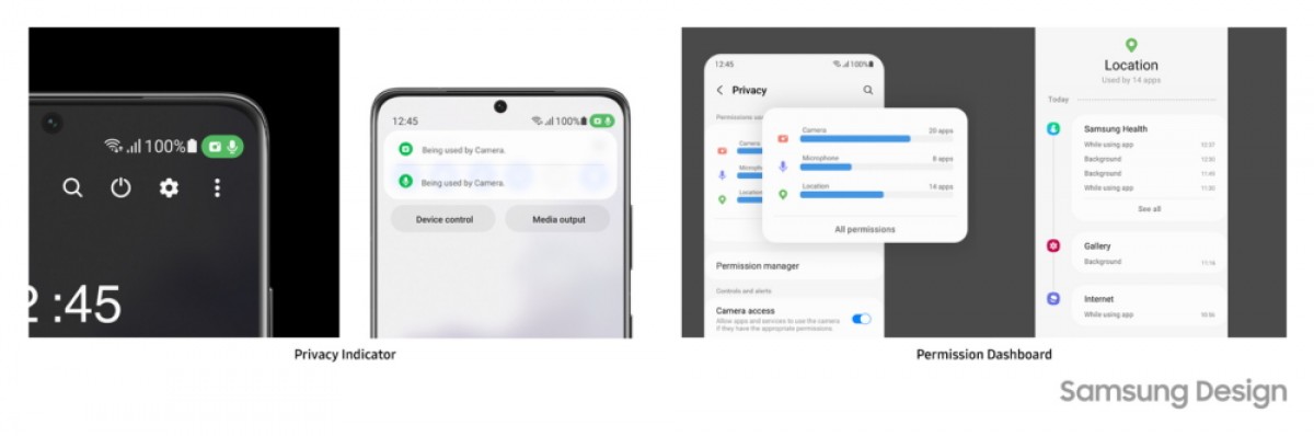
A primary goal for One UI 4.0 was to give users assurances that their privacy is respected. Status bars display privacy indicators that alert you when apps are using your microphone, camera or other functions. The Permission Dashboard shows stats about which apps used what permissions and how often, it also offers the option to revoke them.
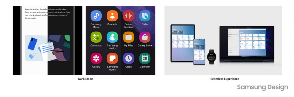
One UI 4.0 lives up to its name by applying the same visual language to various Galaxy-branded products – from phones to tablets, smartwatches to laptops. Getting Dark mode right was tricky as it had to balance visual comfort with preserving the look and feel of apps.
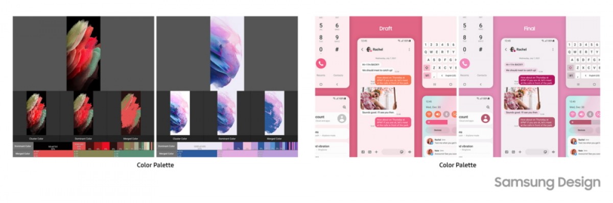
Self expression was also an important factor. The interface leverages Android 12’s Material You color system to extract five colors from your wallpapers and style application UI with them.
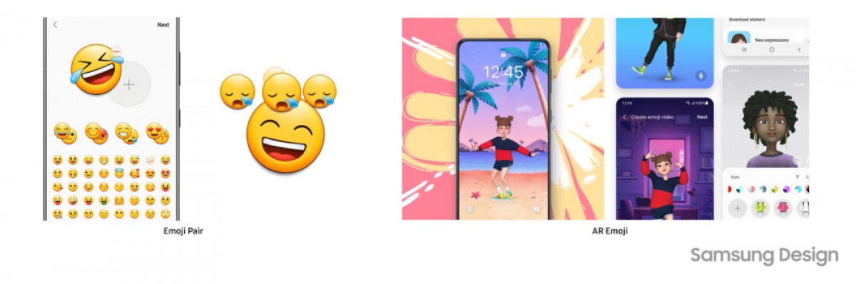
Samsung also created Emoji Pair, which combines a couple of emojis for when a single one doesn’t quite capture your emotion. AR Emojis have gained new animations after polling users what they want to express with them. People in their 20s were more inclined to caricatures while those in their 30s wanted something more realistic. All age groups wanted to focus on positive emotions rather than negative ones, however.
If you want to read more about the ideas that shaped Samsung’s One UI, check out the Q&A post on Samsung Newsroom.