Gmail web redesign is now rolling out to everyone

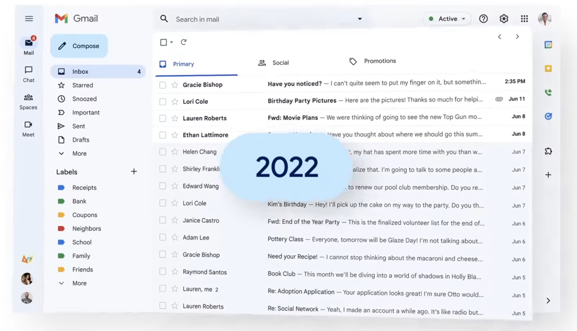
The Gmail web redesign is now available to all users. The rework combines Meet, Chat, and Spaces into a single experience and incorporates features from Google's Material Design 3. It isn't done there, though, and suggests that later this year we'll see improvements to Gmail for tablet users, improved emoji support, and more accessibility capabilities among other enhancements.

It's possible that if you use Gmail for work, it has already been rolled out to your account. For some users, the switch is just too much. You may opt out and revert to the old appearance at least for the time being. If you don't have Chat enabled, you'll still see the new style but in a Gmail-only view by default, and if you don't use any of those applications, you can turn them off or on from the Quick Settings menu. If you want to go back, Google's instructions are straightforward: at the top right, select Settings. Select Go Back to the Original Gmail View from Quick Settings. Reload the new window by clicking it.
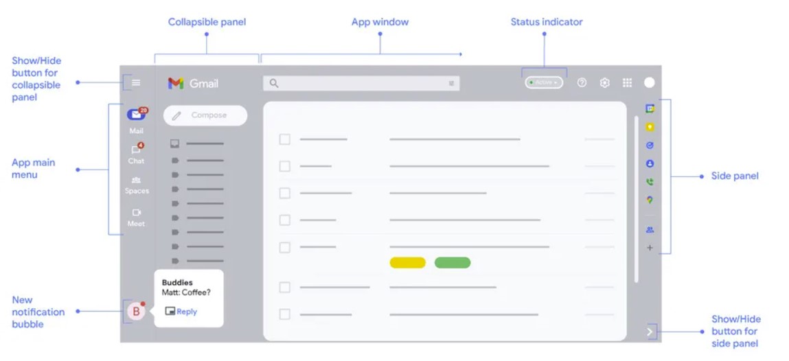
The new user interface separates Mail, Meet, Spaces, and Chat buttons into one list at the top of the left rail rather than displaying numerous conversations from each service in a list. They're still readily available without cluttering up the screen all at once, and you can quickly enter a discussion in any one section by pressing and holding on an icon.
Google is making changes to the Workspace suite (including Docs, Sheets, and others) as part of its broader new approach to the Workspace suite that aims to provide a more uniform look and AI-powered features like the Gmail search upgrades announced today.
Source: www.theverge.com