Huawei Watch 3 Pro review: Harmony computer on the wrist
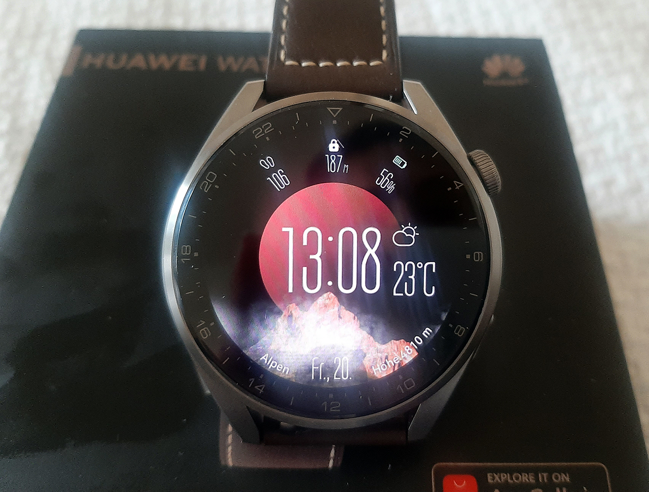
Huawei Watch 3 Series is the brand's first truly smart smart watch series. Its "brain" is the HarmonyOS 2.0 operating system. The same one that has rapidly developed after the introduction and tightening of the U.S. sanctions against Huawei and now applies to all devices of the brand. Together with HarmonyOS, the watch received application support, improved interface ergonomics, multitasking, intelligent assistant (does not work in our country), eSIM (does not work in our country), flexible work with application permissions and +100% (actually more) to the price.
4 reasons to buy Huawei Watch 3 Series:
- it is still the same stylish Huawei watch, but finally with multitasking;
- autonomy - still one of the best in the category;
- design, design and again design;
- good prospects - here will launch Huawei Pay in Ukraine and application developers will disperse - and then they will be priceless.
3 reasons not to buy Huawei Watch 3 Series:
- expensive;
- neither Huawei Pay, nor eSIM, nor intelligent assistant work in our country yet;
- the previous generation is so much cheaper that this is a reason to choose in its favor, if the brand matters.
We had the Pro version of the Huawei Watch 3 Series at our review. There are certainly differences from the basic one, but still much of the text is true for both versions, because what they have in common - HarmonyOS - is much more than differences.
.jpg)
.jpg)
The main differences between the devices: the Pro-version has a bigger screen (46 mm versus 42 mm), a more massive body, sapphire crystal without 2.5D rounding, a microphone and speakers and twice the battery life.
Huawei Watch 3 Pro at the start of sales will cost 15,000 UAH. This puts them in the same price range where Samsung, Garmin, Apple watches are now pushed.
Do they have any chance of finding their buyer in such competition? I think there is. First, because the watches haven't lost their former advantages - design and good battery life. Those who are looking for a watch not on the principle of "I need the cheapest" or "I need it for iPhone" look at the design, and it is one of the best in the category. They also look at the brand - and here again Huawei is in a strong position. Secondly, because no matter how you look at it, the brand has a loyal audience.
Compared to the previous generation, the "three" has both huge improvements and obvious, though small, deteriorations. These include the quality of the screen's oleophobic coating, charger design, battery life and price. The last two, though, are predictable and their reason is the increase in platform capabilities. To take or not to take?
First, it's beautiful
_Q79vWTi.jpg)
Huawei Watch 3 Pro inherits the design of previous generations with some changes. The watch screen is round, the materials are solid and robust, and there are two control buttons. The case is massive and thick.
The screen of the model - Huawei Watch 3 Pro - is bold, with sharp edges, not rounded as in the basic Watch GT 2 and Watch 3. This, as well as the size and dark color of the strap makes the Proshka look like a purely masculine model. Although I like massive accessories and wear this model comfortably. I have not heard any comments from others about the size either, only compliments on the design and questions: "Oh, what is such a cool watch? Are they also smart? Who makes it? Seriously, Huawei?".
.jpg)
The top button of the watch now not only presses, but also spins. Let me remind you, it serves to go to the watch menu with apps - that's its main function, although there is now also support for gestures to call the application manager and emergency service. It makes it much easier to navigate the interface with a long list. For example, the contact list, etc. And it's more convenient than the ring around the screen.
The bottom button launches sports modes by default (you can change to other functions in the settings). It is now larger, but more recessed in the case. And rightly so, this only benefits the watch in both design and ergonomics.
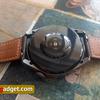
On the back, despite the appearance of a new temperature sensor, nothing has changed. A glossy case with diodes that illuminate the heart rate. The strap is good quality, removable, it can be replaced.
The materials of the case also look well-designed and expensive. It is, by the way, titanium. Here we want to recall all those clouds of cheap Chinese smartwatches that make the case of incomprehensible materials of the same color trying to pass it off as titanium. So, there "budget" ears stick out despite the noble color. Here you can immediately see that the thing is not cheap.
.jpg)
.jpg)
.jpg)
.jpg)
.jpg)

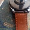
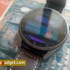
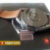
The screen - 1.43-inch AMOLED with a resolution of 466 x 466 pixels, covered with sapphire crystal. Thanks to the sapphire crystal, it is supposed to be more durable than previous generations. Although I have not managed to scratch or break the previous watch generation either.
What immediately strikes the eye compared to those very generations is the oleophobic coating. It's the worst I've seen in the brand's watches and bracelets. And you'll notice it in the photo - no matter how much I tried to wipe the screen, it instantly got dirty.
Otherwise - can't complain. Bright, juicy, with great detail, has auto-adjustable backlighting that works like clockwork. There are hour markers around the edges of the screen.
There are even more displays with the release of the new model, now there are more than 1,000 in the app store, Huawei specifies. There is a feeling that the share of paid ones has increased, or the store itself is tweaking them so as to show more of those available for money, to motivate the user to get the wallet. There are a lot of interesting and different designs in the free versions as well. For money, you can get a watch face that has more information on it.
.jpg)
.jpg)
.jpg)
.jpg)
.jpg)
.jpg)
.jpg)
.jpg)
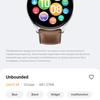
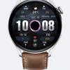
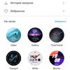

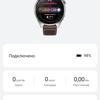
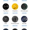
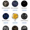
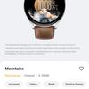
Watches alerts which dials use the most energy (animated, of course). One of my favorite displays (free, by the way) is Mountains. It, too, is animated. Shows the different highest peaks in the world and their heights. That's how I would use it if it displayed calories burned.
Some (even free!) dials can be customized - you can choose which functions are available directly from the main screen. It's also now possible to create your own animated watch faces. With dials from the "Sports" section you can play. For example, you can "throw" the ball to the basketball player. But the more such activity, the worse for the battery.
Second, it's advanced
NFC
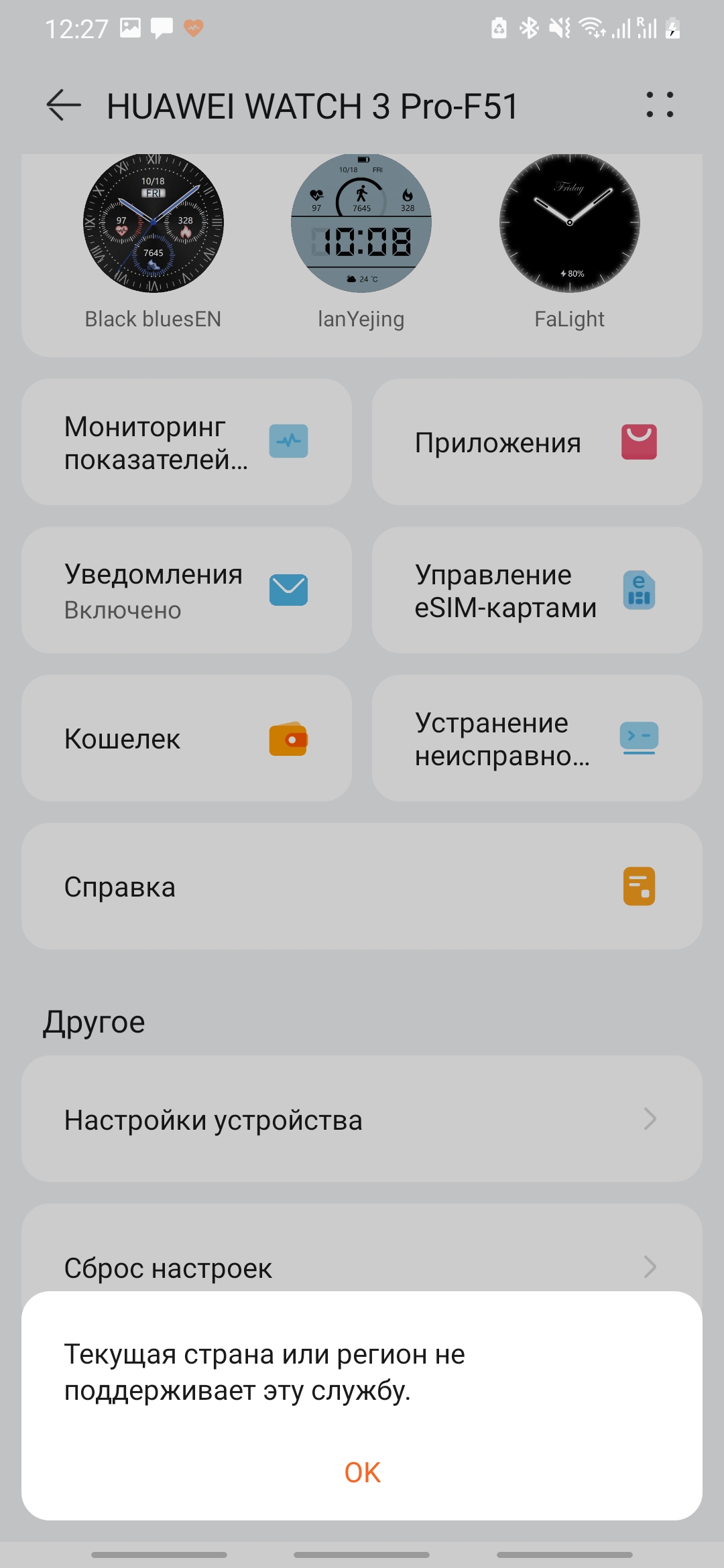
I'll start with the best news - this model has NFC. But the attempt to connect a wallet for payment comes across the message that this service is not available in my region. As far as I remember Huawei was planning to launch its payment solution as far back as the year before last but that hasn't happened yet. I sincerely hope that soon they will work, it will be a very important advantage for the brand.
Along with NFC the watch got a PIN code and a six-digit one. You have to enter it whenever you take the watch off (if you activate it). The watch warns you if you register too simple a PIN (like 000000) but allows you to do so.
HarmonyOS 2.0
This is the first Huawei watch that runs on HarmonyOS 2.0. The company has already repeatedly teased how the devices will work as part of the ecosystem on the new OS. Paired with regular Android, it also works just fine.
Before HarmonyOS, Huawei watches ran on a proprietary system. HarmonyOS equalizes the potential capabilities of the lineup with Samsung and Apple watches. It's multitasking and supports third-party apps. The smoothness of the interface, at least initially, is comparable. The Watch 3 Pro has 2GB of RAM (16GB of built-in memory, by the way) and two cores, but Huawei doesn't specify details.
Why am I writing that the capabilities are potential? Because the mere fact that there is app support does not guarantee that they will be of any use. The user is neither cold nor hot from what is in the AppGallery at the moment. The applications are few, the store offers Russian services like Maxim taxi or S7 airlines, services in European languages, several almost clones of applications with exercises on the clock and one unknown application with the map. Uklon, banks, are you coming?
.jpg)
.jpg)
.jpg)
.jpg)
.jpg)
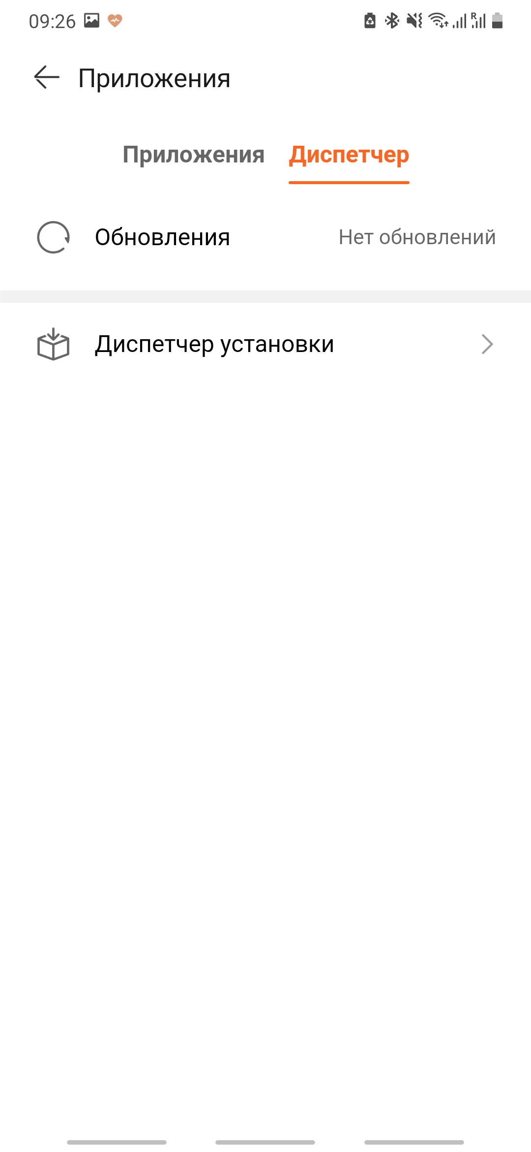



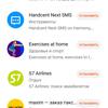


Once upon a time many years ago, the Samsung watch app store looked about as poor. So what we have now is not a verdict. The important thing is that Huawei has the resources to develop more watch apps, as the company has done with smartphone apps.
It's a fallacy to think that third-party apps are useless for watches. What would be cool to have on the watch? Todoist or similar, a map with good navigation, at least something from those that are now available in AppGallery for Huawei smartphones, a paid application for sleep analysis with deeper analytics (Fitbit and Apple Watch experience shows that this has a right to exist), an application with loyalty program maps, a full-fledged voice recorder, messengers (unfortunately, the watch does not yet allow to reply to messages at all), taxi services, financial services. I think that time will pass and all this will appear.
There is a permissions manager for applications. Some features may not work without them. And without activating AppGallery on the watch and giving the right permissions, you can't install apps on the watch. A small thing, but really cool.
While app support is still a feature for now, multitasking is a great feature for a brand watch in the here and now. Now, for example, a running timer doesn't paralyze all other activity on the watch, and you can see messenger messages while you're working out. The latter I particularly missed in the previous generation of the watch.
The smoothness of the interface remained the same. But there is a slight but annoying delay in turning on the screen when you raise your hand when the workout mode is active. In addition, the watch I had a couple of times hangs, with the previous generation this did not happen.
.jpg)
.jpg)
.jpg)
.jpg)
.jpg)
.jpg)
.jpg)
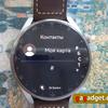
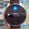
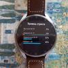
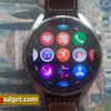
Sports and Health
There are changes in the sports functions of the watch, but minimal. The workout modes themselves have not changed. There are, by the way, 100 of them here. The watch has automatic workout detection, but it does not always work and is not deactivated in time too, by the way. Once in transport, check manually.
.jpg)
.jpg)
.jpg)
.jpg)
.jpg)
.jpg)
.jpg)
.jpg)
.jpg)
.jpg)
.jpg)
.jpg)

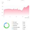
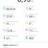

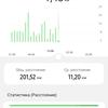

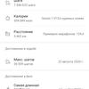
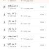
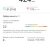
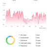
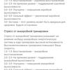

You can now see more details about your recent workouts in the watch menu - you used to have to reach into the app for that.
Also, the watch now shows fatigue percentage and time to recovery in a separate section. Previously, this could also only be viewed in the app
.jpg)
.jpg)
.jpg)
.jpg)
.jpg)
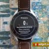
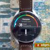
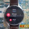
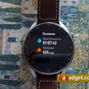
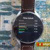
The health alerts in the app menu have become smarter and more detailed. Especially in the issues that relate to sleep. The user now gets the first thing not just the bare numbers, but an explanation of them as well. Also, the watch scolded me for getting my sleep pattern off again, where I went to bed and woke up more than usual for several days in a row and didn't sleep well.
.jpg)
.jpg)
.jpg)
.jpg)
.jpg)
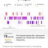
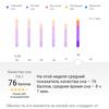
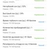
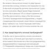
The updated app is slower, by the way. It slows down during the data sync phase with the clock and in general it has taken longer to navigate between menu sections. I hope they fix it, because the updates come often.
Temperature
Any doctor would certainly be skeptical if you were to demand that they take the measurements taken by non-medical wearable electronics seriously. Temperature is no exception. So this is another "strictly for personal use" watch chip.
This is what my stats look like.
_2oQDyG5.jpg)
_R2zOIBV.jpg)
_wfQHnZU.jpg)
_qB5nNth.jpg)
_mtkOayM.jpg)
_tEgeWJC.jpg)
_vbpbC1t.jpg)
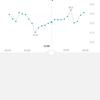
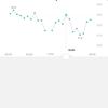
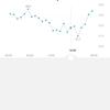
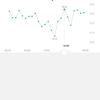
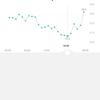
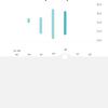
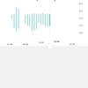
The temperature drops during the day, with the lowest being during training, rising at night, and peaking around 6-7am.
I can only draw one conclusion from this. The clock probably measures temperature more correctly in sleep, and it naturally rises closer to awakening. During the day, especially when moving a lot and intensely, the problems start because it rides back and forth on my hand.
The difference between daytime and actual readings is very big. For example, as I was writing this, I was surprised to find out that my regular mercury thermometer reads 37, while my watch reads about 3.5 degrees less. Honestly, I couldn't find any information on the internet about what the norm is in the difference in temperature between my armpit and my arm.
There is another curious fact that has been talked about mostly on the wave of the coronavirus epidemic. A person has an elevated temperature at night a few days before symptoms appear, as the body fights the virus. So, in the process of testing the clock, I picked up an SARS, but if you look at the charts, there's no way to know.
Anyway, so far, it's a toy for the sake of a toy. No one will tell you better than a thermometer, symptoms, and your own sick look in the mirror about an impending illness.
Other features
eSIM support. The watch can receive calls, etc. without a phone, to the same number. The connection is very intuitive, but only works with SIM cards that support this function. In Ukraine there is no support yet. In other countries, where available, the service must be connected through the operator.
Fall detection. If you fall, the watch will call 112.
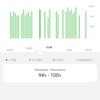
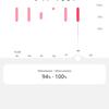
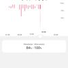
Continuous monitoring of blood oxygen levels. Not like before - after manual startup.
Lots of animation. This watch isn't just multitasking and on a smarter OS, it's also mega-animated. Even the reminder to get up after an hour of sitting now shows a three-dimensional animated avatar. And how does the battery manage to survive after that?
Apple Watch-inspired app menu. Finally, the endless smartwatch menus - in a handy Apple Watch-inspired package. With a long press, you can move them around the screen and delete them. Those accustomed to displaying apps as a list have been left with a loophole in the settings.
Voice Notes. Not a voice recorder, of course, but will do as a last resort. Very much looking forward to the arrival of the voice recorder!
Different vibration. It feels like it takes longer to swing and gain power compared to what's on the older models. I don't feel good about it. It used to be better. But those who like to wake up to a smooth rising alarm clock should like it.
New control gestures. You can now answer the call by clenching your fist (the feature needs to be activated in settings). A double tap on the menu entry button brings up the app manager, while a five-tap triggers an emergency call.
Speakers and microphone. If you answer a call from the watch, the sound will go to them. They're not very loud, so it's worth doing at home, in the car, or in the office. You won't hear anything on a noisy street.
Application interface. It has been significantly updated, there are new features. By the way, I could only get the latest version that this watch works with from AppGallery.
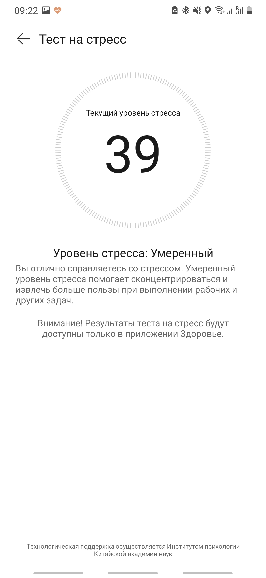
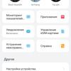
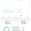
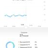
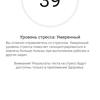
If you want to know more about the basic features of Huawei smartwatches and bracelets - read Huawei Band 6 review. In general, they are standard for the market: there is an organizer with timer, stopwatch, etc., there is a cycle calendar, stress monitoring, breathing exercises, remote control of music and camera and many other pluses. The manufacturer also claims smart assistant support for some markets. Not ours, alas.
.jpg)
.jpg)
.jpg)
.jpg)
.jpg)
.jpg)
.jpg)
.jpg)
.jpg)
.jpg)
.jpg)
.jpg)
.jpg)
.jpg)
.jpg)
.jpg)
.jpg)
.jpg)




Third, still long-lasting
The manufacturer claims up to five days on a single charge in "smart" mode and up to 14 - in power saving mode. Without third-party apps, but with active temperature, heart rate, and whatever else I can measure in non-stop mode, my watch lasted six days, then about three to four days each.
Taking into account that it has multitasking, and that there are more sensors by one, I think the result is awesome. The same Samsung and Apple watches last less. And certainly with the move to Google's OS, the Galaxy Watch is likely to catch up to the Apple Watch with its day and a half of use at best. So the Huawei Watch 3 has a head start here.
What's gotten worse in my mind is charging. In the second generation model, the charging socket was removable. So you didn't have to pull a million cables on a trip, it could be plugged into any Type-C, very convenient. Now there's no way without a watch cable if you're going for a long trip. The charger itself, by the way, is now glossy.
.jpg)
In the settings of the watch appeared another power saving mode - ultra - it turns off the data transfer mode and Wi-Fi, limits access to some applications, changes the watch face to a more energy efficient. And when you turn on Always On Display, the watch warns you that the battery will melt twice as fast.
The Huawei Watch 3 takes a couple of hours to charge.
The model also supports reverse wireless charging from your smartphone. Unfortunately, I don't have a smartphone that supports the technology, so I haven't had a chance to test it.
What are some alternatives?
Comparing Android and HarmonyOS watches with Apple Watch can only be done out of sporting interest, but we will not do it within this review.
In the Ukrainian market the watch competes with Samsung and Garmin.
Similarly, I think that in this case we should not compare the capabilities of the platform head-to-head. There are three parameters by which smartwatches in the top price segment can objectively compete:
- favorite brand;
- design;
- contactless payment capability.
Even battery life is largely irrelevant. Favourite brand is a subjective thing, I think that Samsung and Huawei have more loyal users. Design is a matter of taste, but in my opinion, Huawei has a head start over everyone. The brand has no luck with contactless payment yet. Among other platforms only Garmin can offer this function at the moment.
There is one more nuance which I recommend to pay attention to - and honestly it is the most important - it is the brand you use now. Changing platforms is a silly thing to do, as the capabilities of different platforms are not so drastically different that you lose years of history, move to a different app, etc.
When it comes to competition within the lineup, it's a bit more difficult to choose. I can't say that I can't live without some new features of this model (remember, I use Huawei Watch GT 2 42 mm myself). If you use older generations of Huawei watches and they are no longer enjoyable - you can think about a replacement.
If you are on the "second" generation - I recommend to wait for the launch of contactless payment, eSIM and filling the store with useful applications. Then this starship will be unmatched.
In a nutshell
Thanks to the new OS, Huawei has finally asserted itself in the "expensive-rich" smartwatch niche.
Competitors should definitely start getting nervous and twitchy about their future: Huawei watches flaunt design and build quality, against other brands that release watches on "smart" OS are real long-livers. And once they introduce contactless payment and eSIM and the ability to respond to messages, it will become even harder to compete with them.
Speaking of today and the model's place in the market, I would compare the Huawei Watch 3 Series to the new niches that manufacturers are launching. This was once the case at the dawn of Google's OS-based smartwatches - they were hopeful, but not very clear in terms of real user benefits. Or the Macbook on an ARM processor - a very iconic device for the market, but clearly designed for a loyal audience that won't wait for the new technology to be rolled out to the market.
Watch 3 Series is a watch for brand fans and technology pioneers. For those who approach the purchase rationally, though with love for the brand, I recommend to wait at least a few months when the price of the model will settle and maybe launch something that is not yet available in Ukraine. The watch is definitely cool, but not all its potential benefits have already "matured", so now you will trivially pay dearly for the promise of a good future.
The price difference with the Watch GT 2 Pro is more than double. So those who aren't chasing the latest in technology should take a look at these as well. Aside from the price, they significantly outperform the newcomer in terms of battery life.
8 things to know about the Huawei Watch 3 Series
- The Huawei smartwatch is finally multitasking;
- HarmonyOS is cool, at least for a watch;
- Don't expect the same battery life, multitasking eats it up, although this generation still has it good;
- This is the most expensive Huawei watch;
- And it still hasn't learned to answer messages.
- Temperature sensor is useless;
- Design and build quality - fire!
- When Huawei Pay will work in Ukraine, with this watch it will be possible to pay, and when eSIM - to leave the phone at home and stay connected to the same number.