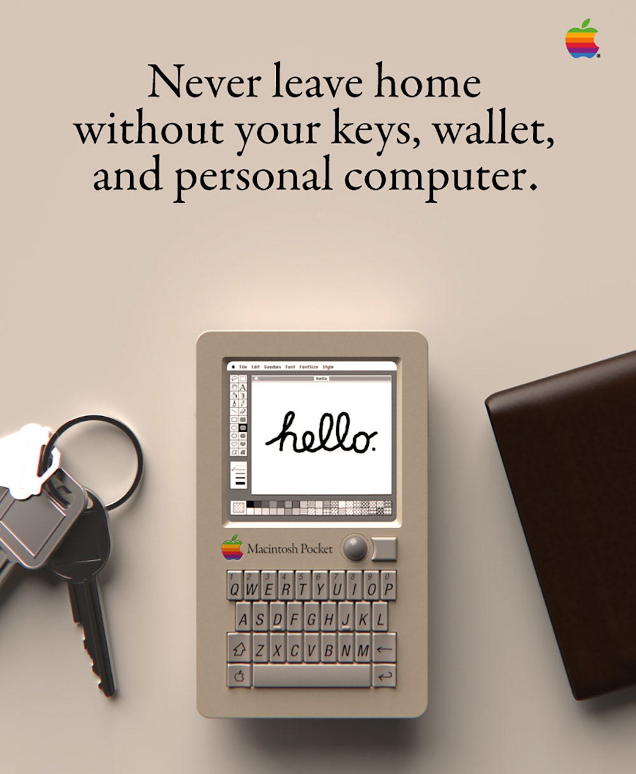
This Macintosh Pocket computer concept makes us wish we had a time machine
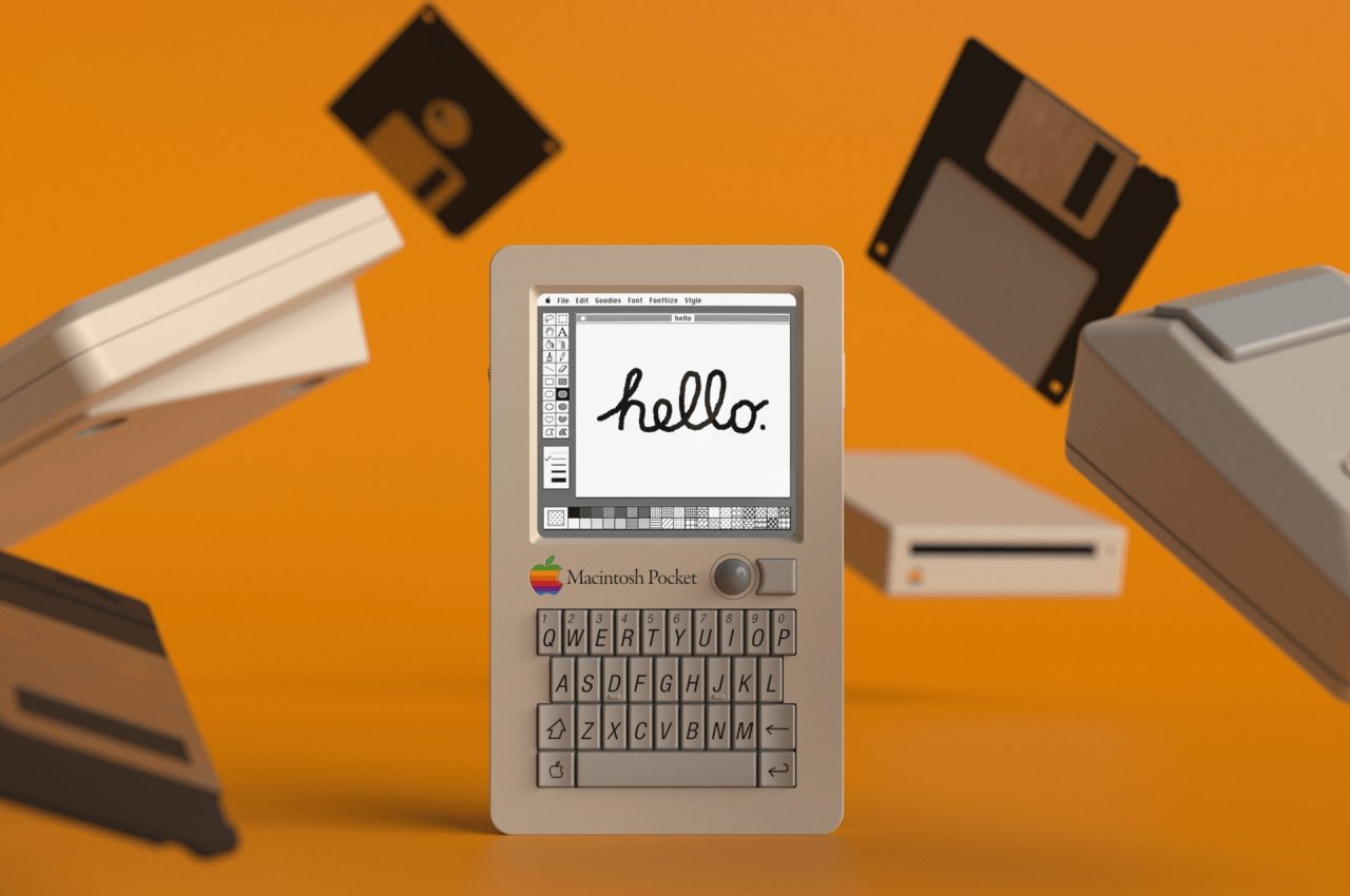
They always say that hindsight is 20/20, but that really doesn’t mean much when you can’t change what has already happened. While many of us might try to reverse the damage done or take different actions based upon what has already happened, that is not possible. Fair enough, the predecessors made the best of what they knew and could not have foreseen the changes that would impact the world. The young Steve Jobs of the 80s, for example, probably never saw the iPhone or even the BlackBerry coming, so we can only imagine how things could have turned out if Apple had the knowledge and resources to make a pocket computer back in the days. We were fortunate to find an answer that was interesting.
Designer: Rex Sowards
Apple tried briefly to enter the pocket-computer market but the Newton was more targeted at Palm. Palm was the market leader in this niche during that time. Although it wasn’t pocket-friendly by any standards, the Newton tried to bring new features and ideas into the then thriving personal digital assistant market (PDA). However, the Newton was unable to last a decade after failing to live upto Steve Jobs’ notoriously high standards.
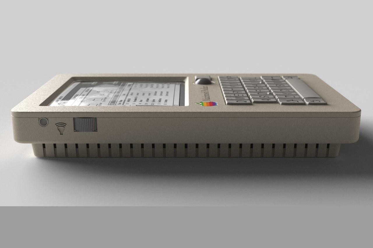
This Macintosh Pocket doesn’t simply rehash a failed idea. It draws its DNA instead from two different sources. You have the QWERTY keyboard, which is a small space and has been synonymous with BlackBerry. You also have the 2-step design of the Game Boy Pocket, which is why the name “Pocket”. At the same time, you still have the telltale design language of Apple from the late 80s to early 90s, like that off-white color scheme and Macintosh keycaps.

The concept doesn’t simply slap on a display and a keyboard on a Game Boy body and call it a day, though. It was difficult to imagine how the pointer on a small device would work. Both a touch screen and a BlackBerry-esque touchpad were out of the question. A Lenovo nib would be equally unlikely. Sowards instead took inspiration from the PowerBook trackball’s famous design, which was reduced in size. He even took the extra step to pattern the button after the PowerBook’s design, making it curve around the trackball on one edge rather than being perfectly square.
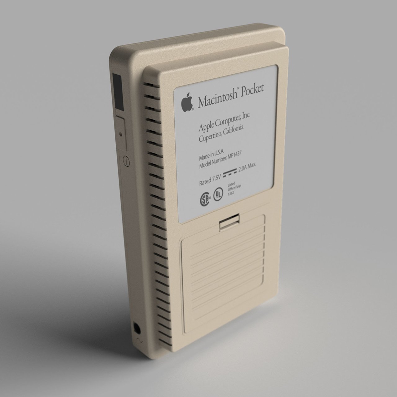
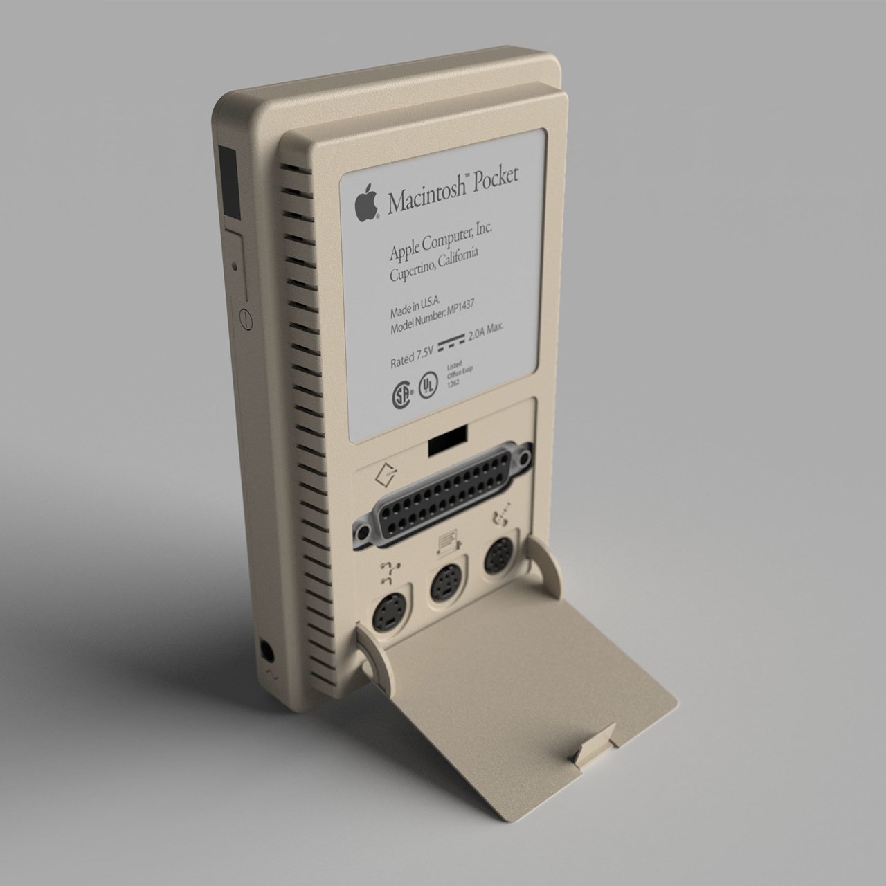
The back of this device is equally interesting in how it hides the ports that were standard on the Macintosh Classic. The most logical positions for these would be on the sides, but that would have cluttered the gadget’s design, a big no-no for Apple. It is possible to hide it behind the Game Boy’s battery compartment. This allows you to maintain a clean design without compromising functionality. It is obvious that there is no space for any floppy drives of any size.
It’s probably questionable whether the Apple of the 80s would have adopted such a design, even if they magically foresaw BlackBerry’s becoming the de facto standard mobile device in the business world. It’s still an interesting thought experiment, though, combining designs and lessons learned by various companies across various industries. The craziest thing about this concept, however, is that it is probably completely doable today, thanks to 3D printing and small PCBs. It won’t be able to run the old Mac OS, though, at least not legally, but it could still be an interesting foray into what could have been if the stars were just aligned differently.
Source: www.yankodesign.com