Soundcloud rethought the start page with clever playlists and curatorial music collections

One of the first music streamings Soundcloud rolled out a new redesign. Now the start screen of the service on desktop and at mobile applications looks very different. By Idea this design should become canonical.
What changed
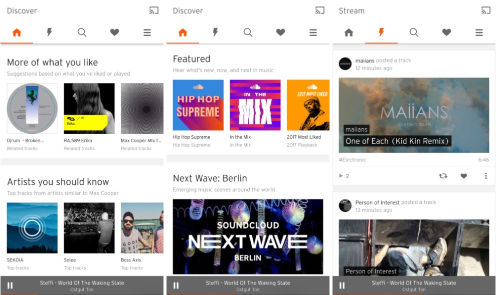
Earlier Soundcloud met the Stream tab, on which was the last releases of musicians and labels that you licked. Now the main page has become smarter. Stream stayed, but at video of a separate stream.
Near It's next to the Upload tab. AT her Soundcloud will sip music that you might like - genre playlists or musicians that you should listen. Select it he will be on based listening history.
So on The Featured tab appeared on the main page. which will be displayed the most fashionable on todays music. Flows in it will be divided into Next Wave (new musical directions) and Playback (hot young artists). AND all this harmoniously fits on one start screen of the application.

How to upgrade
All this update takes place automatically on servers SoundCloud, so you do not You need to update the application itself to see.
Source: techcrunch