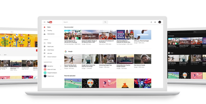
How to enable the new YouTube design with a dark interface

Developers Google has long been testing the new design of the YouTube site in the style of Material Design, and now it can be appreciated by all comers. The service team removed unnecessary elements, distracting users from the content, making the interface as simple and convenient as possible, and the transition to the Polymer framework will speed up the introduction of new features. One of them was a night mode with a dark design.
How to activate?
YouTube has already translated some users to a new site design, the rest is enough to go to youtube.com/new and click on the "Try" button. After that, you can change the light color scheme to dark. Night mode is included in the menu, which opens by clicking on the user's avatar in the upper right corner of the page (or a button with three dots if the user has not logged into his account). Here you can also return to the classic view.
The new design of the YouTube site corresponds to the interface of mobile applications, but when it becomes the standard - Google is not informed. From the account menu, users can send feedback and suggestions.
Source: YouTube Blog