Apple changed the design of the web version of the App Store

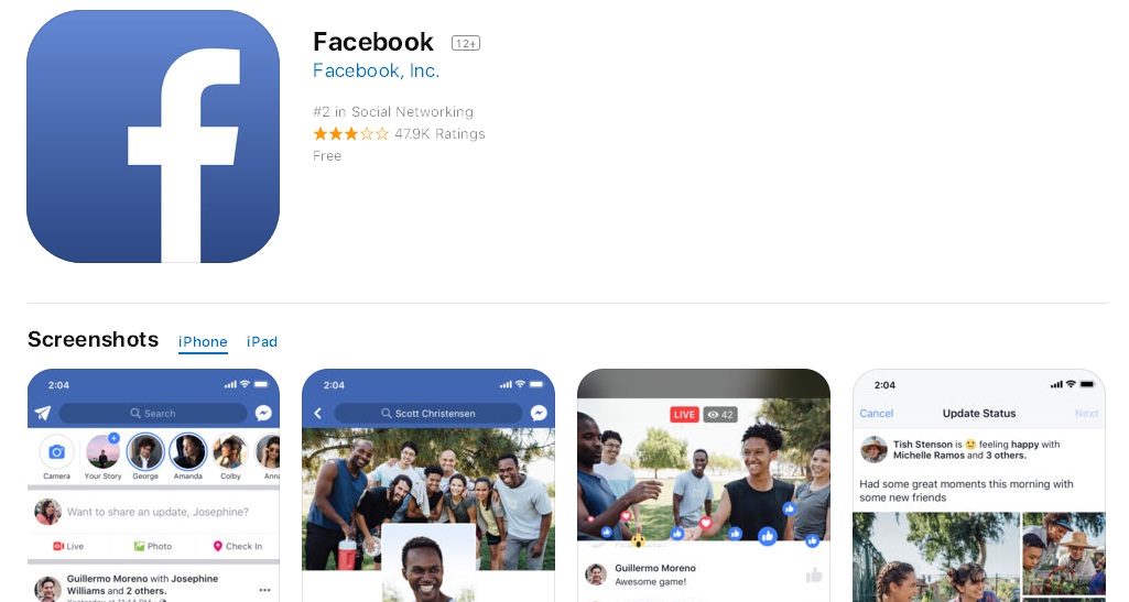
Apple introduced a new design of the web version of the App Store. Now he look like App Store in iOS, which is completely changed in Last year. Thus, now the picture and at browser, and on the screen of the iPhone is the same.
What changed
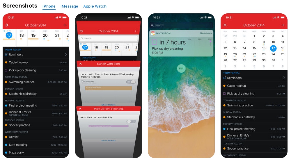
The first thing that rushes into eyes - graphic information in the very beginning. The there is first the user sees the screenshots of the application, and only after this - detailed information. Maybe someone will be uncomfortable with this - scroll down to see the application description. But at Apple felt it was better to see once than to waste time on reading.

At the same time, the themselves screenshots: now they are made with iPhone X. You can also view images from iMessage, iPad, and Apple Watch by clicking on necessary tab.
In addition, in The new interface has increased the font and size of images.

Thus, the new App Store has become more consistent with the look of iOS 11, and there will be whether he convenient - to solve to users.
What's with the Mac App Store?
Some innovations also awaited the Mac App Store. In particular, pre-order applications appeared here, both in the App Store. You can make pre-orders in MacOS High Sierra 10.13.2 and newer versions.
Source: 9to5Mac