Google Drive moves to a new design after Gmail

Google decided to refresh the look of all of its services. A couple of weeks ago we were offered to try out a new Gmail mail interface , and now it's the turn to the online storage of Drive.
Bright future

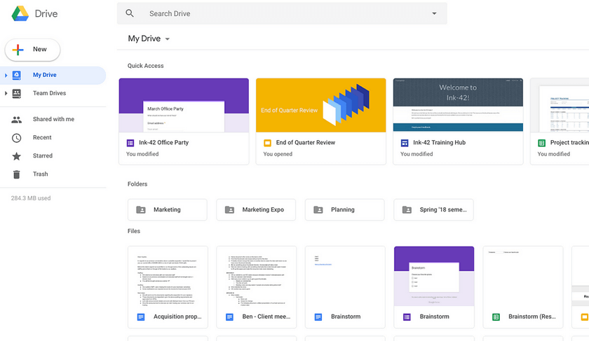
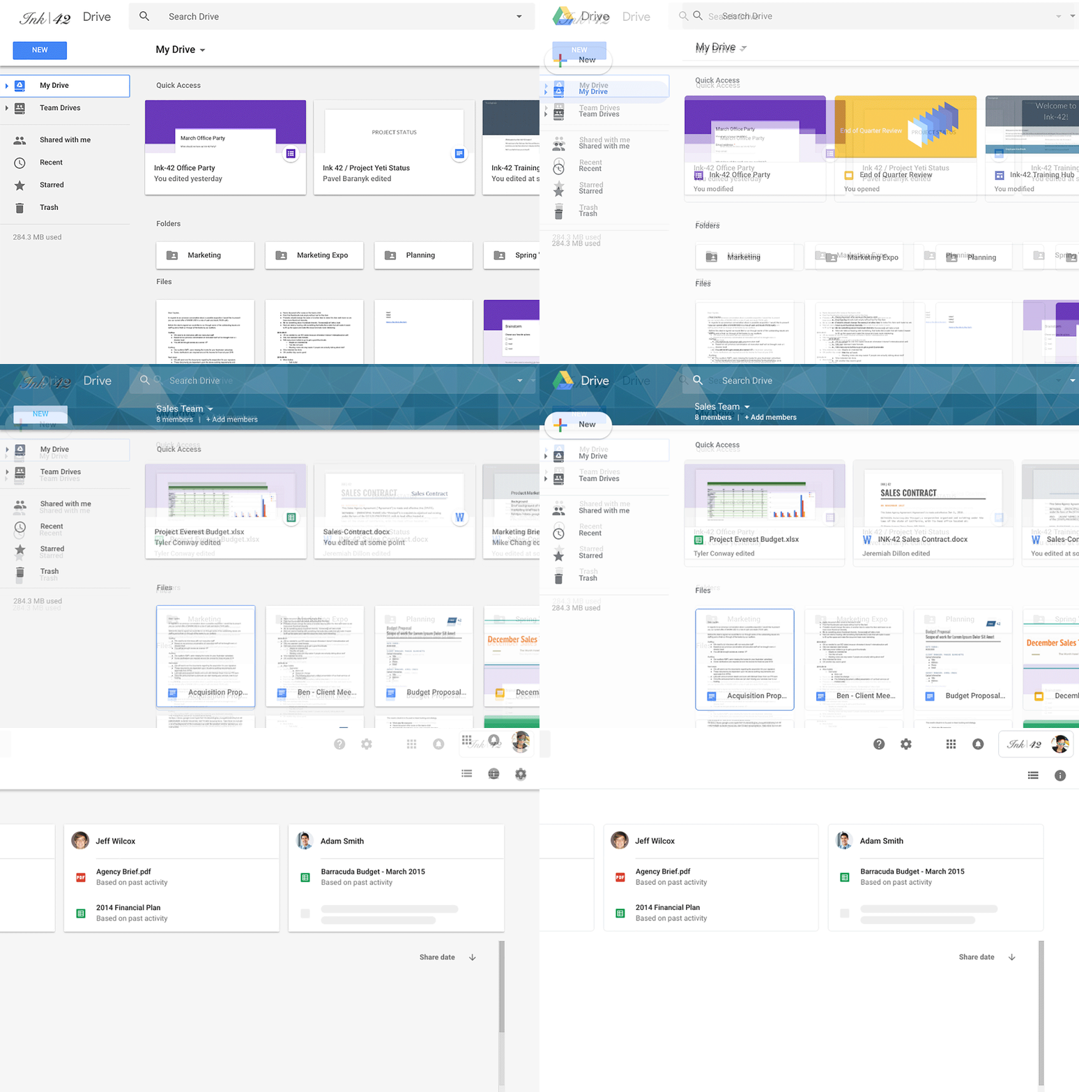
There were no global changes in Google Drive, just the design was aligned with the updated Material Design concept. The add button is now rounded, and the gray background is replaced with white. In the business accounts of G Suite, only the Drive icon will be displayed to the left, and the company logo is moved to the upper right corner. The search giant changed the standard font, and the settings and help buttons were placed behind the search line. Actually, that's all for now.

When?
The new Google Drive web interface has already appeared in G Suite, and other users will be able to evaluate the changes in the next few days.
Gradually, all products of the company will switch to a new topic, Google Material Theme. For example, in the canal assemblies of the Chrome browser, a design with rounded edges of the tabs is already being tested.
Source: Google