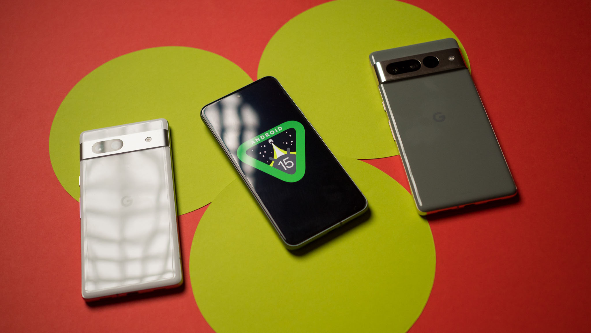
Google is redesigning the status bar icons in Android 15, making them look like Samsung icons

In the new version of Android 15, Google is planning to make significant changes to the design of the status bar icons.
Here's What We Know
According to information from our colleagues at Android Authority found in Android 15 Developer Preview 2, Google's status bar icons may become more similar to those long used by Samsung. Specifically, segmented battery and network connectivity indicators have been found in the firmware. In addition, the battery charge display may become horizontal.


Android 15 may also introduce more haptic feedback, such as vibration when pressing quick settings switches and changing volume. These innovations aren't publicly available yet, so it's possible significant changes or they won't make it into the final version at all.
Android's last major redesign came when it moved to the Material You colour scheme based on the wallpaper from Android 12. While Android 15 doesn't appear to offer a similarly major update, this could be one of the biggest Android design changes on Pixel phones we've seen in a long time.
Source: Android Authority