YouTube Music updates the design of artist pages

YouTube Music first significantly updated the design of artist pages in 2019, followed by some Material You tweaks. Another update is currently being tested to give the platform a modern look and improved functionality.
Here's What We Know
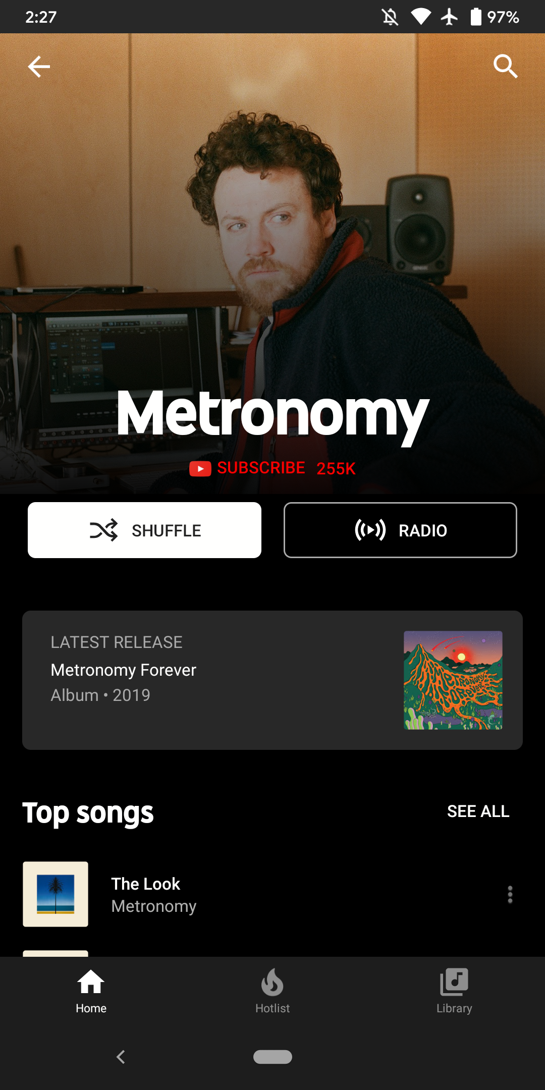
The last major update to the design of artist pages on YouTube Music took place in 2019. One of the main changes in this update was the move of the artist's "About" description, which was usually taken from Wikipedia, from the top of the page to the bottom. This changed the structure of the page, making it more modern and easier for users looking for information about artists on YouTube Music.
The cover image occupies the top of the page with no margins, followed by the band or musician's name and a subscribe button. This is followed by the shuffle and radio buttons, which were part of the 2022 Material 3 upgrades.


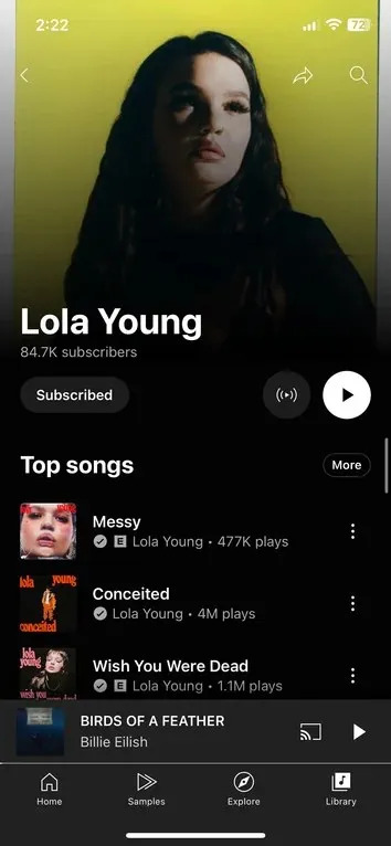
The new design includes moving the artist's name to the left, with the number of followers displayed below, and a subscribe button with corresponding circular radio and play buttons on the right. These changes make the pages more modern and user-friendly.
The innovation is currently being tested and is not yet available on the official YouTube Music apps for Android and iOS.
Source: 9to5Google