Google Maps gets updated design with tables on Android

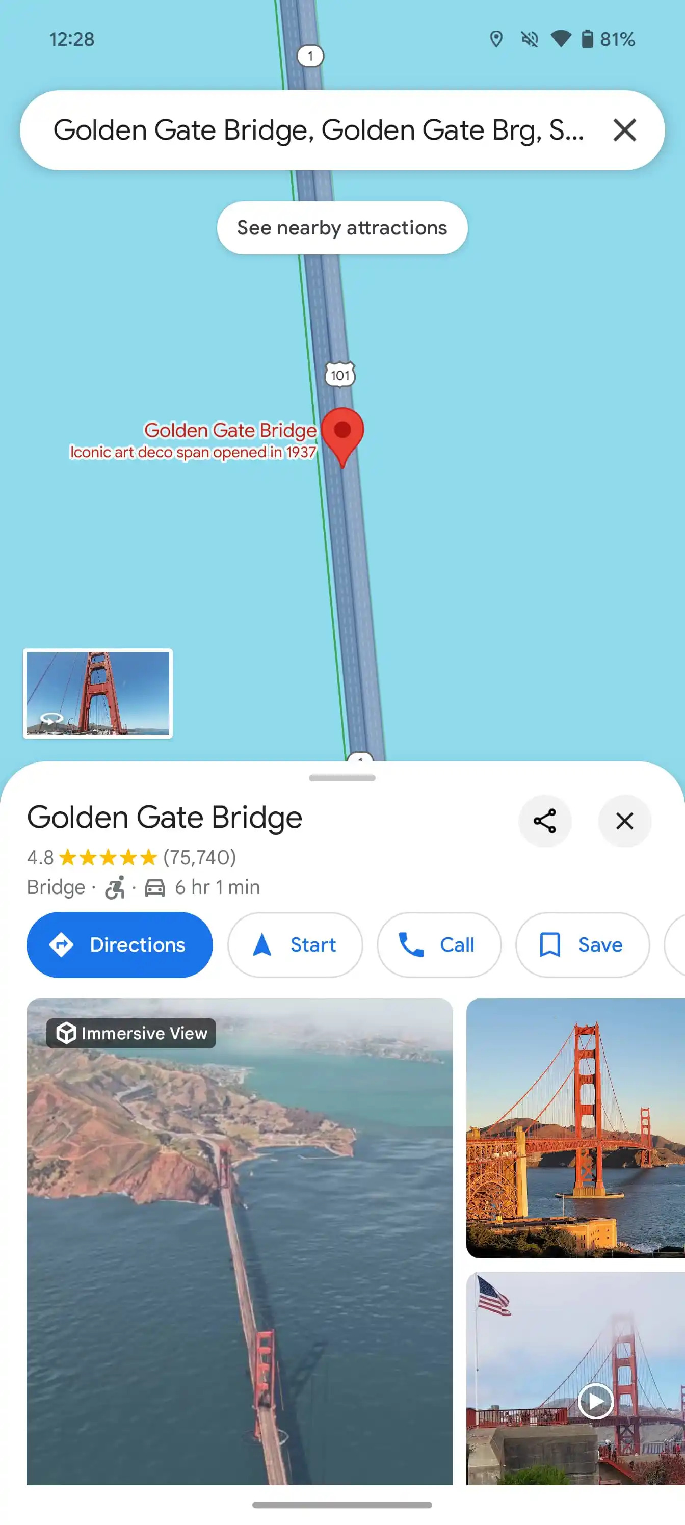
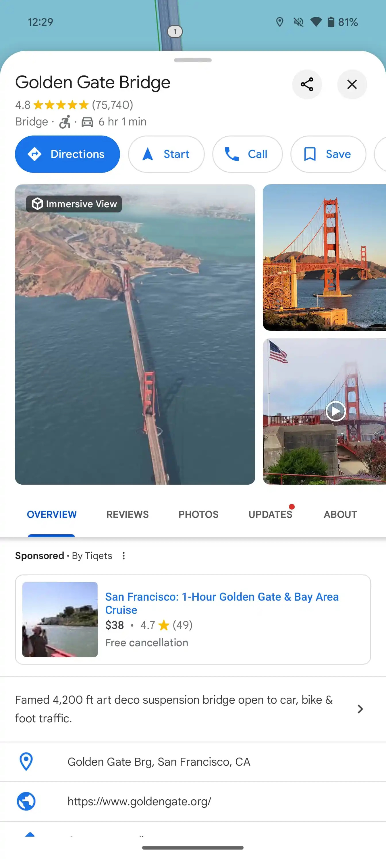
Throughout 2024, Google Maps for Android was testing a redesign that replaced most full-screen user interfaces with more compact tables.
Here's What We Know
These tables with rounded corners show the background map more often, making the interface lighter and providing more context when navigating. To close these tables, you can tap the "x" button in the upper right corner or swipe back from the left/right edge of the screen. With this update, the ability to swipe up on the search bar to simply see the map has disappeared.


Another significant change concerns the search for routes. The initial interface with the fields for entering a destination, choosing a mode of transport and a list of recent locations remains unchanged and still occupies the entire screen. However, after entering the destination, only the start and end locations appear at the top of the screen, and the transport mode switch has been moved down for better accessibility. This interface also uses tables.
Google started testing the new design in February, but later it was suspended. After making some changes, testing resumed in May. Over the past few days, the updated design has become available for Android users of the stable version (11.136.x) of Google Maps. The update is not currently available for iOS.
It is expected that in the future, Google Maps will simplify the bottom navigation bar, leaving only three tabs.
Source: 9to5Google