YouTube Music updates the design of the main feed on Android and iOS

YouTube Music has made several changes to the design of the main feed on Android and iOS in recent weeks.
Here's What We Know
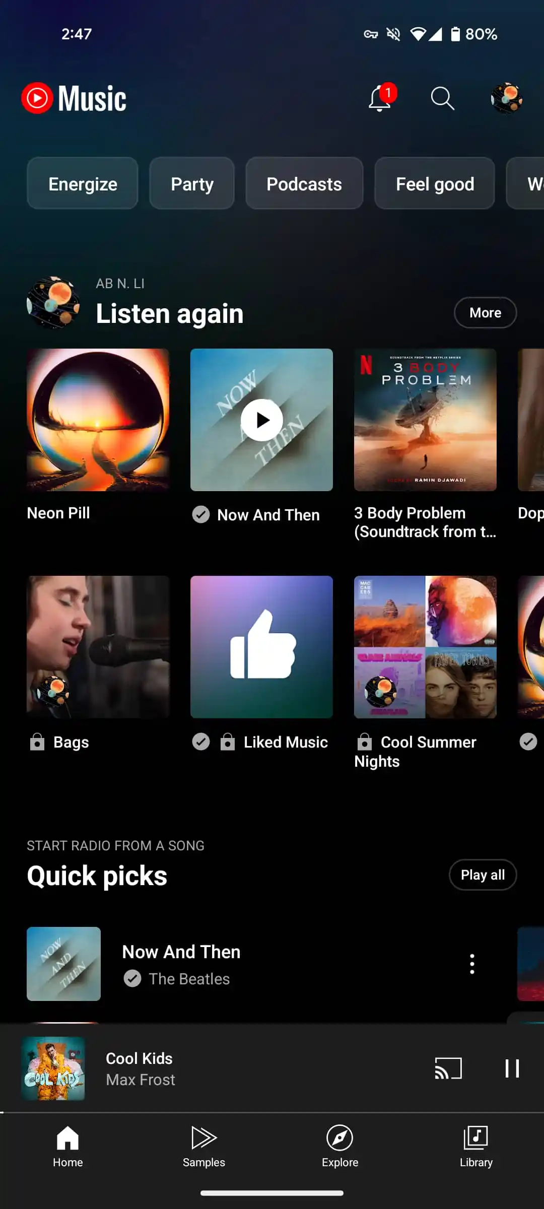
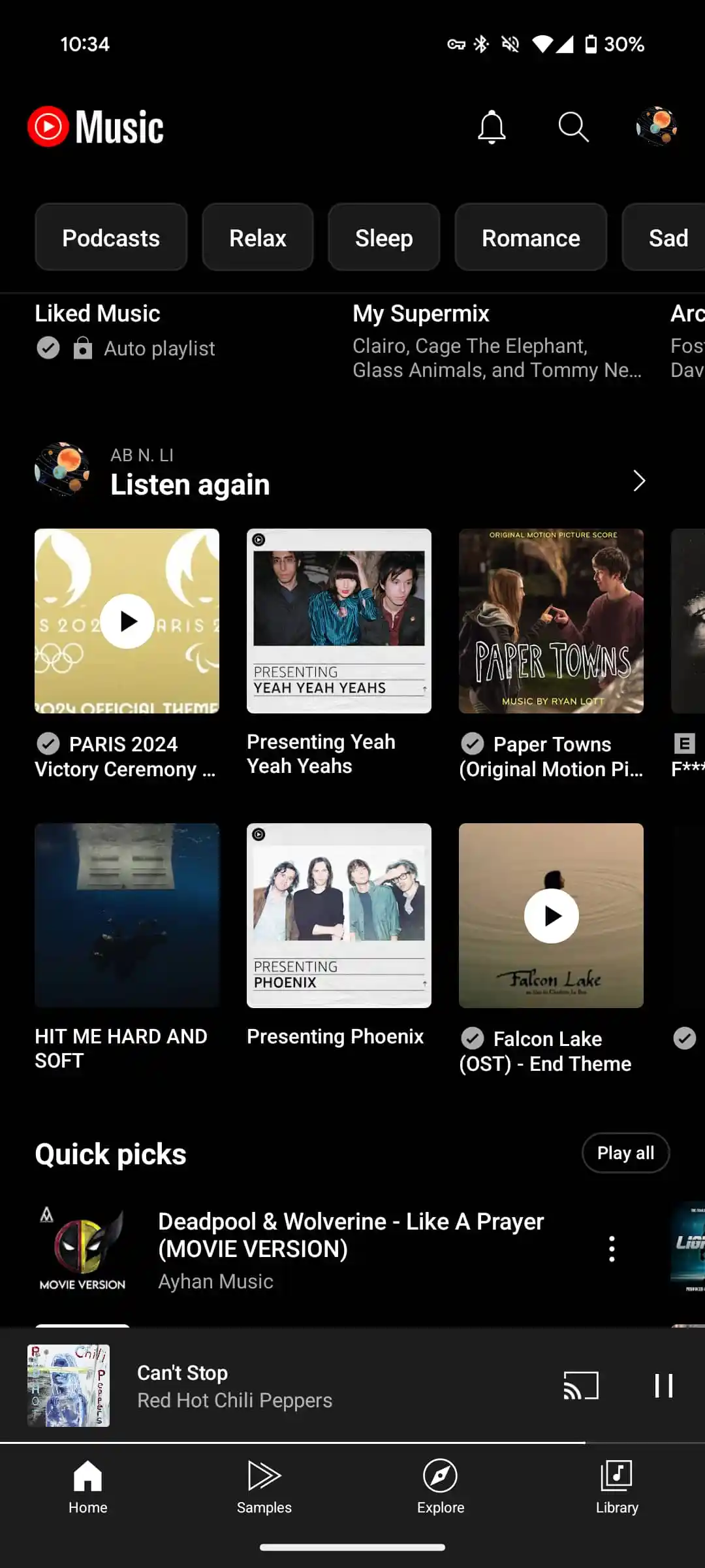
One notable change was the replacement of the More button with a right arrow icon, making the interface less cluttered and easier to see. The "Play All" button has remained unchanged for Quick Select and other similar sections.
Carousel header sizes have also been reduced, and the second line of descriptions has been removed. For example, the Quick Select section used to say "Start a radio from a song", now it just says "Create a radio". Below you can visually compare the interface before the update (first image) and after the update ( second image).

It's not yet clear if YouTube Music will continue to replace the Quick Dial with the new 3×3 design, which some users have already seen, but it hasn't been rolled out widely yet. These updates are already available on the YouTube Music app for Android and iOS, but there are no changes yet on the web version of music.youtube.com.
Source: 9to5google