Google Tasks gets a modern redesign with a card-based interface

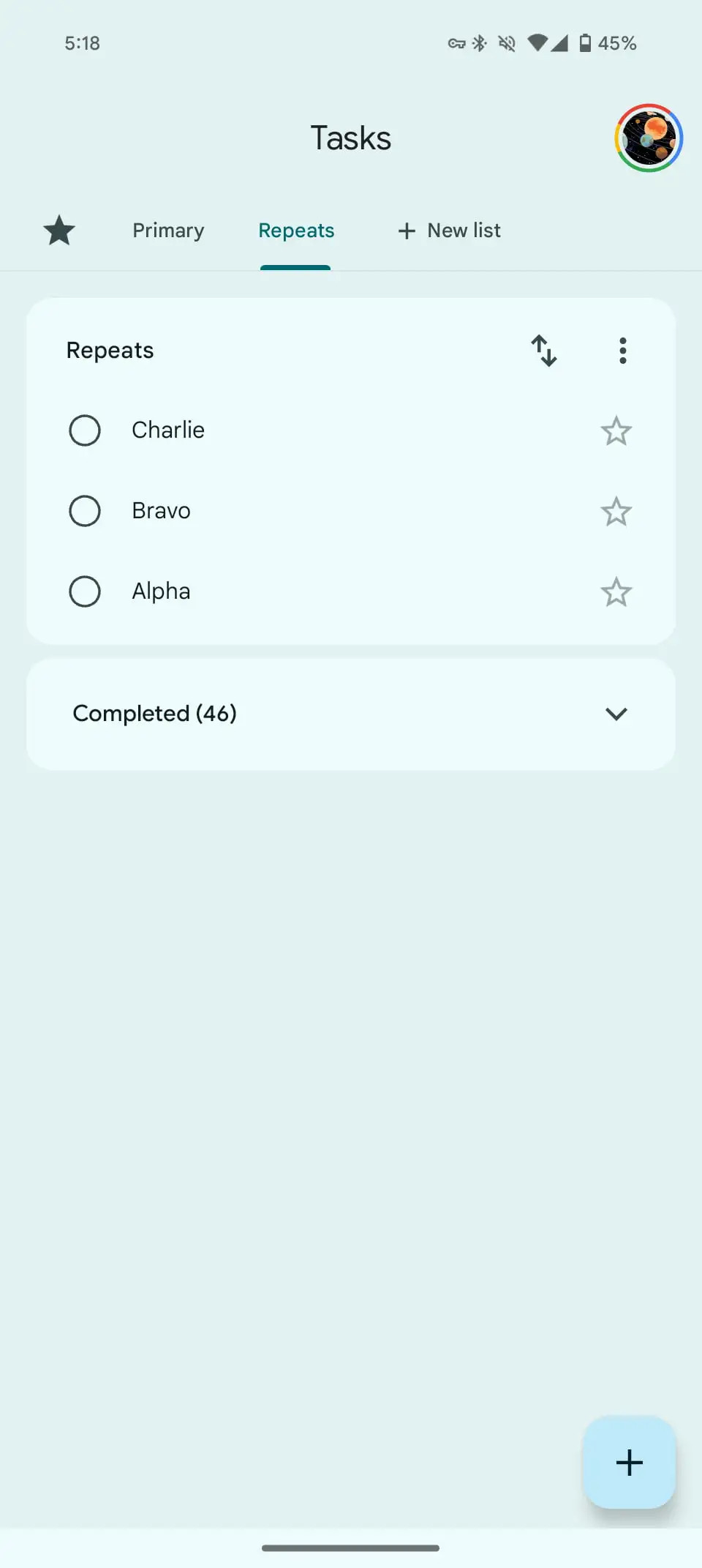
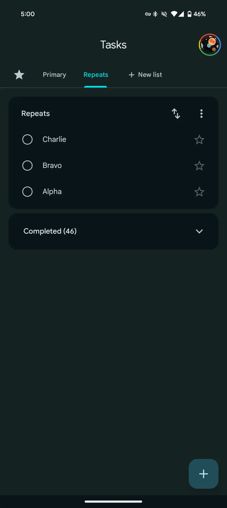
Google has begun rolling out a major redesign of its Google Tasks app for Android. The main innovation is the introduction of a card-based interface, which makes the app more convenient for viewing and managing tasks.
Here's What We Know
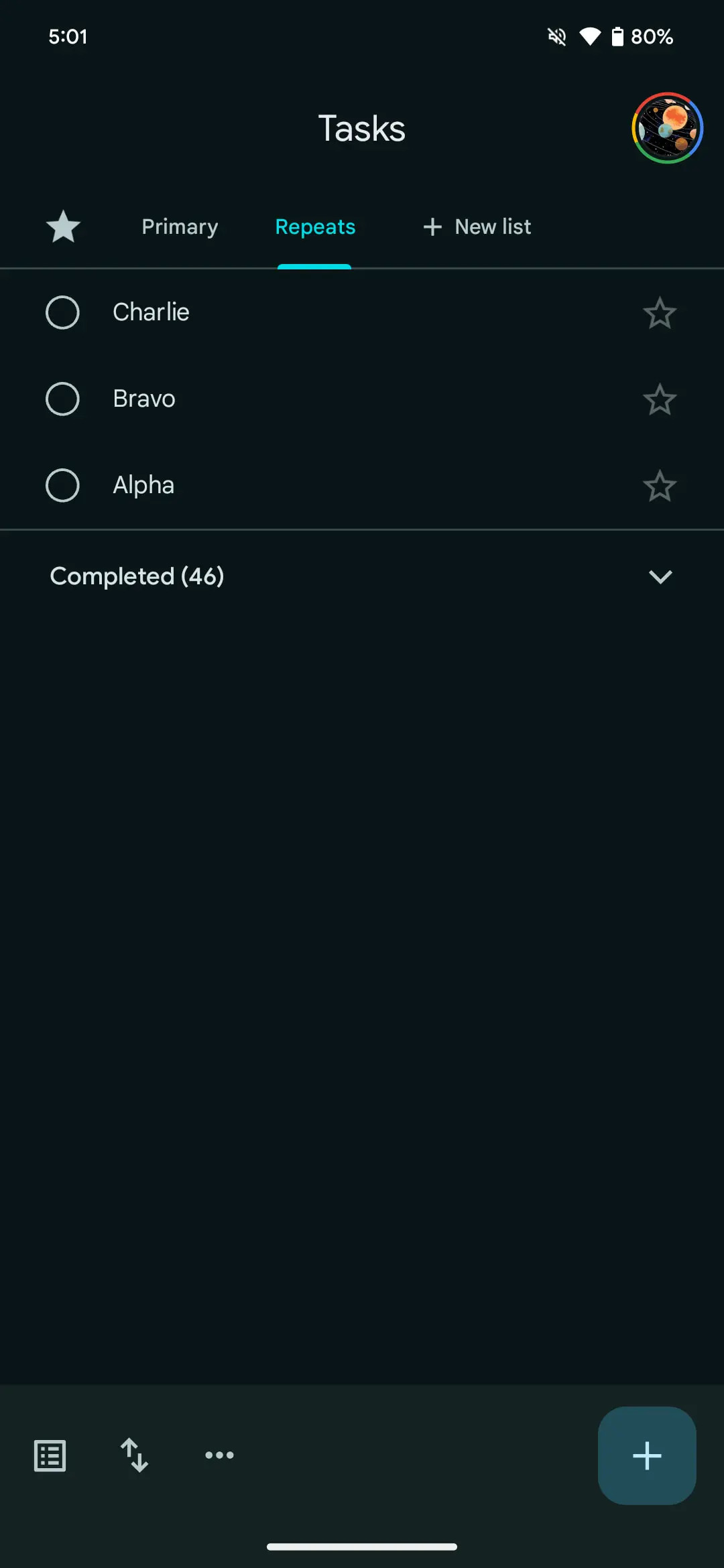
The settings menu is now located in the upper right corner of each card, making it easier to access additional features. The bottom application bar has also been removed.
In addition to visual changes, Google plans to integrate reminders from Google Keep into Google Tasks over the next year.


The redesign of Google Tasks also improves the dark mode experience, where task cards are now more clearly separated by contrasting with the background. The floating action button (FAB) remains in place, allowing you to quickly add new tasks. Other interface elements have been optimised for easier navigation.
The update is gradually becoming available to all Android users.
Source: 9to5Google