Simple and convenient: Google app gets new design

The Google app has a new design that makes it easier to use.
Here's What We Know
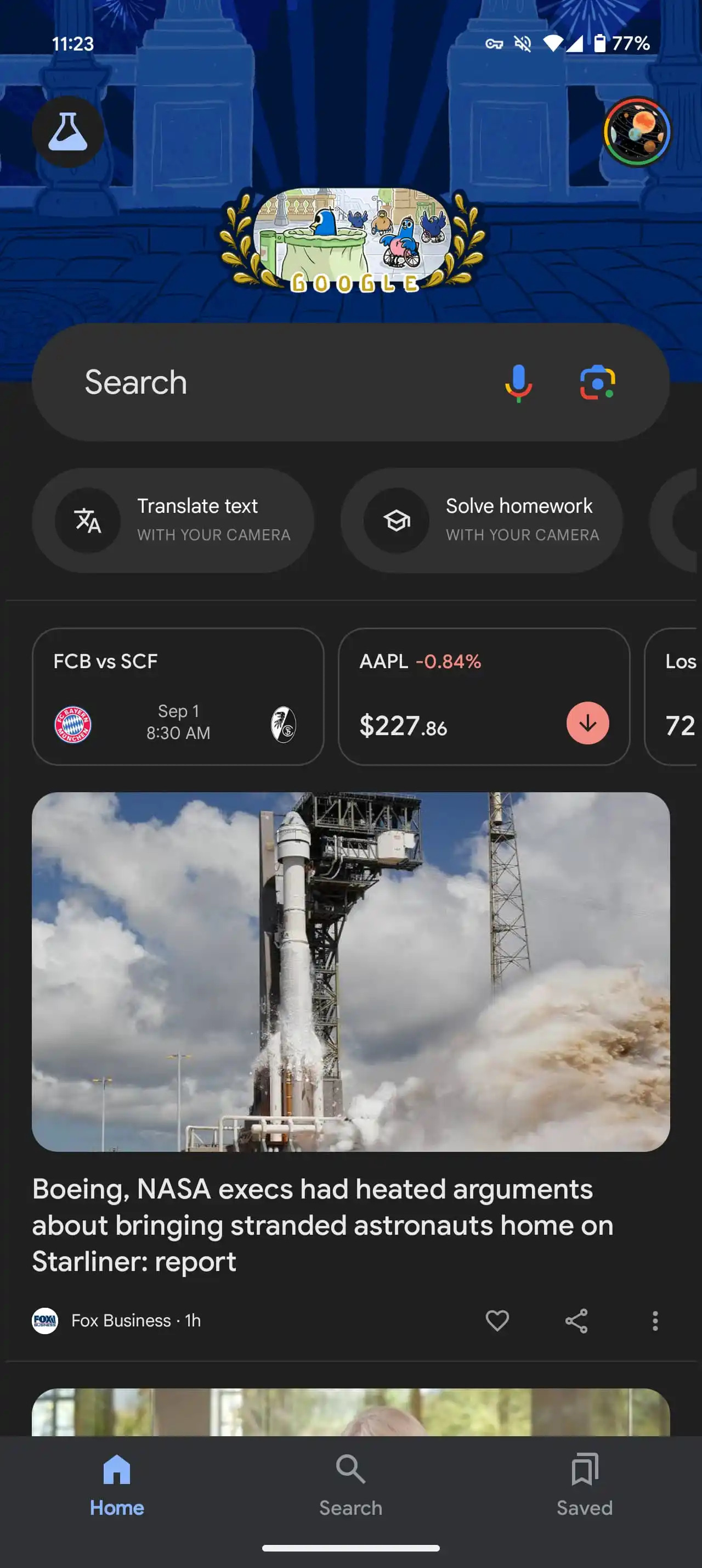
Previously, there were five shortcuts below the search bar, each with a lot of text and descriptions. They were used to search for photos, translate text, do homework, identify songs, and shop from screenshots. Now these shortcuts have been simplified, made smaller and clearer.

The new design simplifies these shortcuts by replacing them with smaller icons with coloured backgrounds. Icons now clearly communicate functions, and most of them open with Google Lens, with the exception of Sound Search.
The redesigned interface allows you to see all four main icons at once, and scrolling is only required for new screenshots. The "your space" cards are now more conveniently located at the bottom. This design has already been implemented on iOS and appeared in the beta version of the Google app (version 15.34) on Android.
Source: 9to5Google