BMW has revealed an updated emblem and hardly anyone noticed it

BMW has quietly, without announcement, updated its famous emblem. The premiere took place at the IAA Mobility 2025 motor show in Munich along with the new iX3 electric crossover, which showed the corporate identity of the future Neue Klasse range.
Here's What We Know
Against the background of discussions about the design of the grille and headlights, attention has slipped away from the emblem, although it is its changes that will be permanent for the next models of the brand.
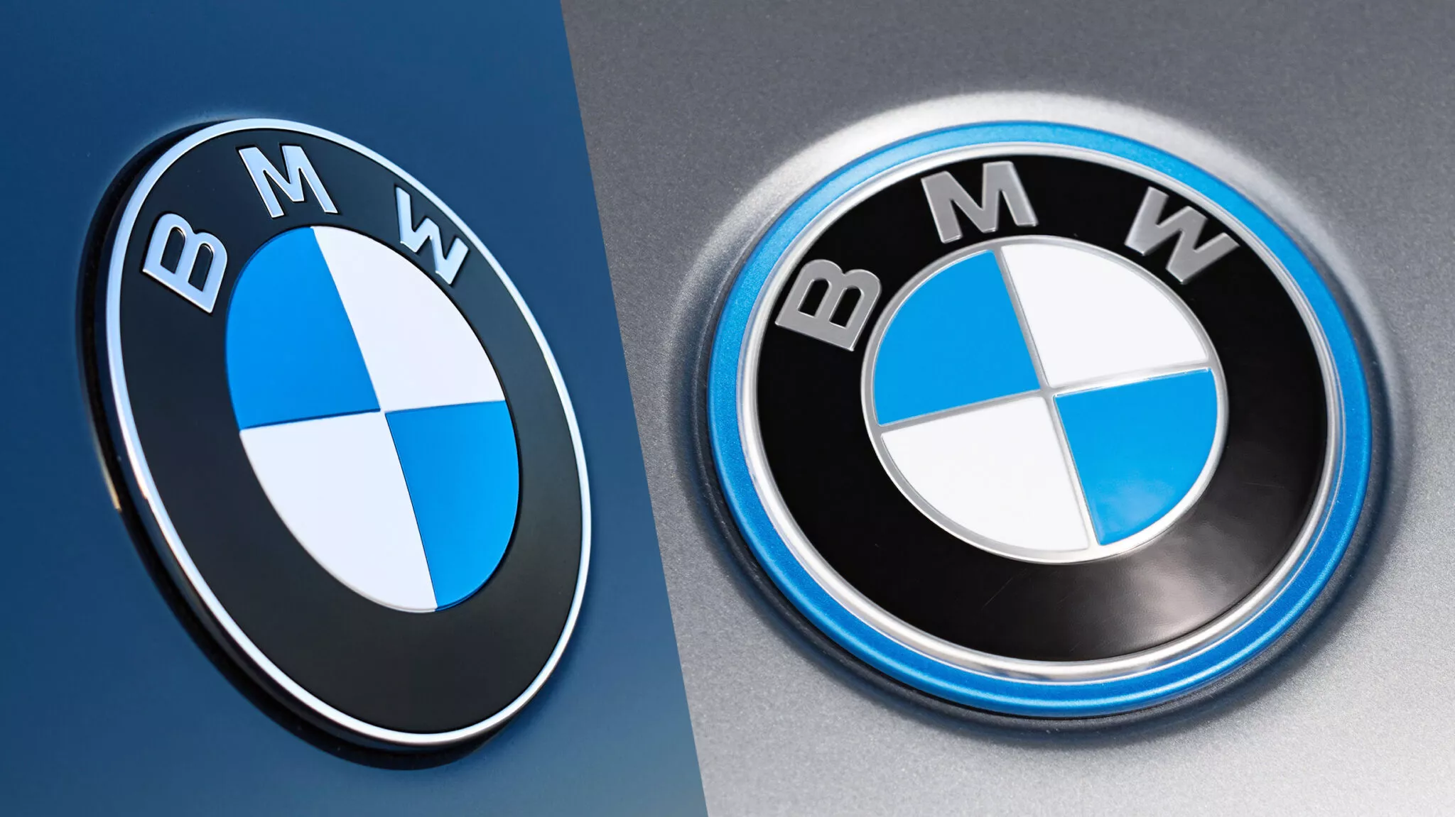
The main difference is less chrome. Gone is the inner ring, which used to separate the black circle with the letters BMW from the propeller with white and blue cells. Also removed are the chrome dividers between the sectors inside the emblem. The remaining chrome now has a "smoky" tint.

The updated and old versions of the BMW emblem. Collage: Carscoops
The blue rim that BMW used to distinguish electric cars like the iX1 is also gone on the new iX3. Also, the letters are thinner, the black background looks matte, and the badge itself seems flatter.
This is not the first experiment with the logo: five years ago BMW already presented a simplified version, but it was used only in marketing materials. Now the updated logo will appear on production cars. First on the iX3, and later on other new or restyled models.
Source: Carscoops