In macOS 26.1 beta 3, Apple replaced the controversial drive icon, but the new one also raises questions

Apple updated the icon of the internal drive in the third beta of macOS 26.1 Tahoe, responding to user criticism of the previous design introduced in macOS 26.0.
What was wrong with the previous icon?
In the Tahoe 26.0 version, Apple introduced a new Liquid Glass design and replaced some icons. However, users noticed that the system disk was displayed in the form of a hard drive with a characteristic cover and even a warning sticker. Users were puzzled by the fact that Apple was one of the first to switch to SSDs and had long since completely abandoned the use of hard drives in all devices. The company even switched to a new file system, APFS, which is more adapted for operation on flash memory. Apparently, the artist simply prefers the complex technogenic aesthetics of a hard drive.
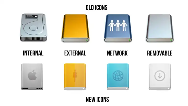
Old and new macOS icons. Illustration: ithome.com
Apple took the feedback into account and introduced an updated version of the icon in the latest beta version. Although the new version looks more like a power bank than an SSD, it still corresponds more to the real state of affairs, so now nervous users can return to their screens. At least until they notice that there is no need to turn gears to set up the system, and no need to use a compass for web browsing.
Source: 9to5mac.com