Google launches Google Play store redesign for Wear OS 3.0 smartwatches. But not for everyone yet
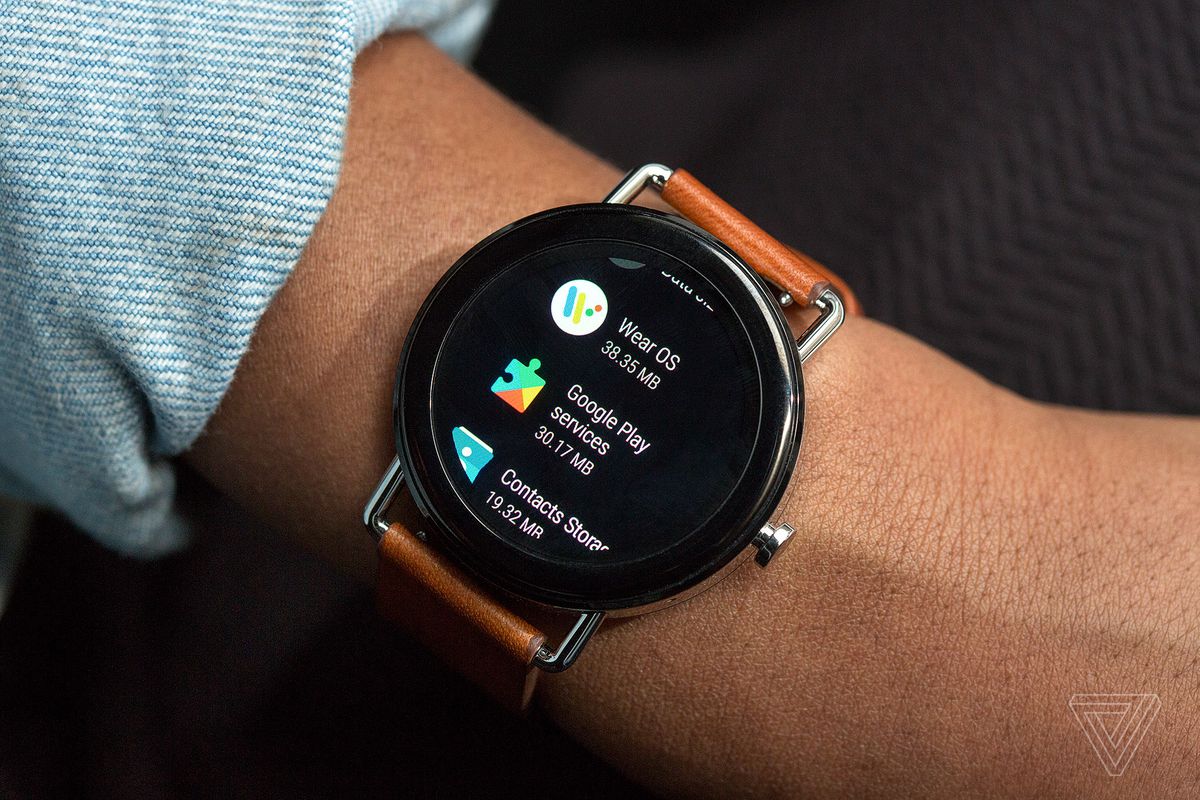
An The best of Wear OS and Tizen: the new Google Wear OS unveiled, where Samsung and Fitbit smartwatches are migrating to at the Google I / O developer conference in mid-May. And now Google seems to have taken on a redesign of the Google Play store.
What has changed
Information about the new interface for Wear OS 3.0 was shared by a Reddit user with Suunto 7 watches. However, it is rather strange that, besides him, other users have not yet received a new look with Material You elements.
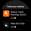
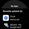
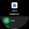
Nevertheless, there are visual changes: the icons have become round and reduced in size, and the text size has also decreased. Apparently, this was done the way that more information could be placed on a small screen.
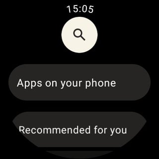
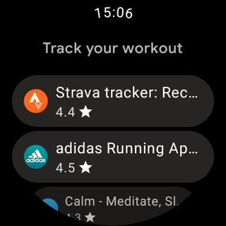

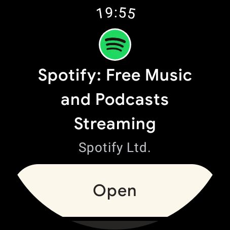
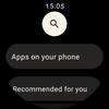


New design
At the same time, the application lists are mostly unchanged, but the "Open" button has changed shape and now occupies the entire width of the display. In addition, the search icon was repainted from green to white.
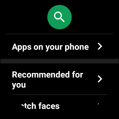

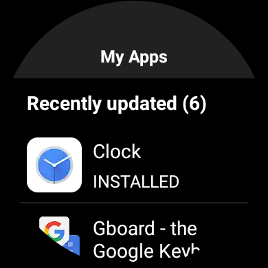

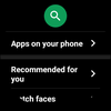
Old design
As a reminder, the last time the design of the Google Play store for Wear OS was changed at the end of 2019.
Source: 9to5google