What will be in Android 12L and how it will look
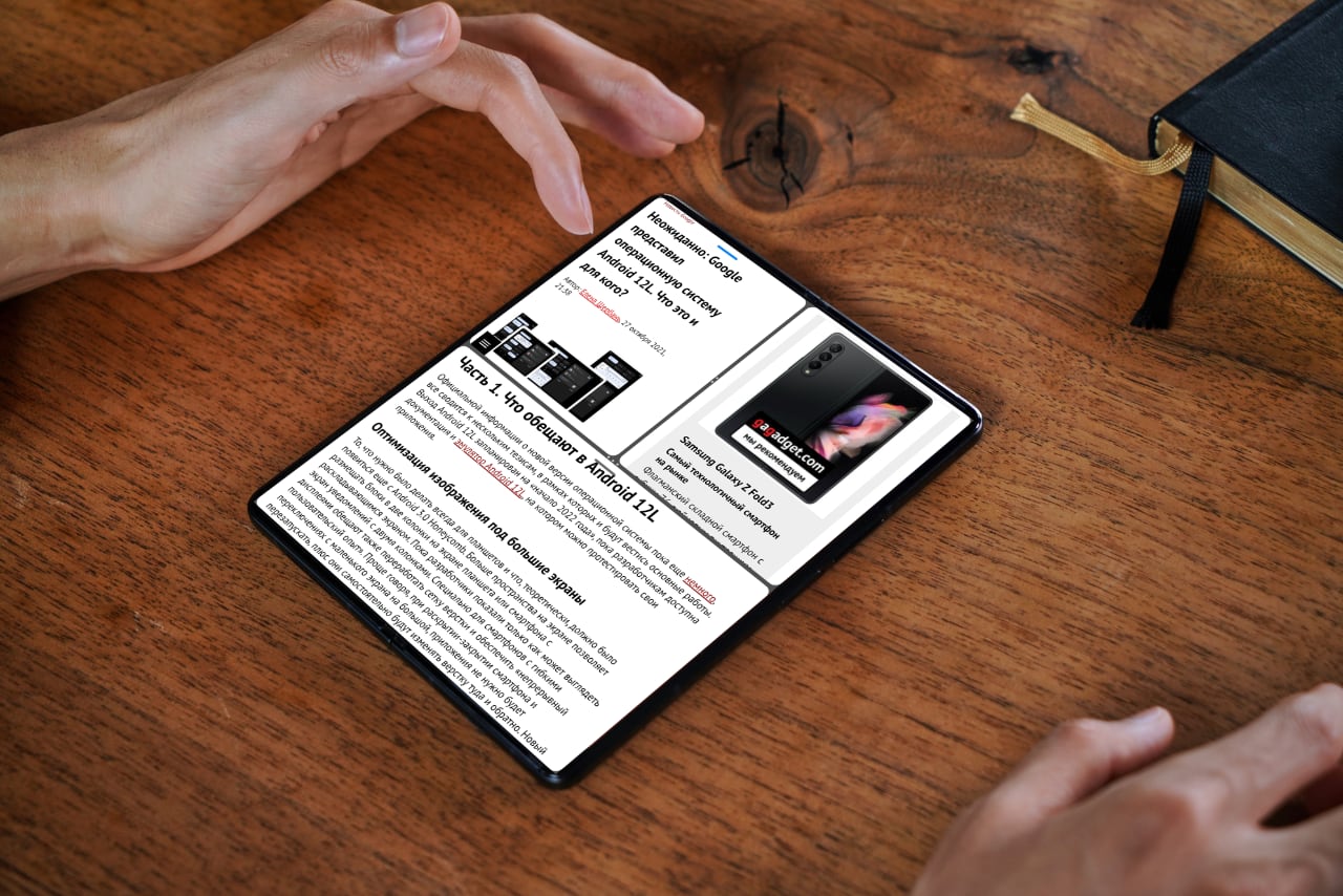
This year Google (or it would be more correct to say - Alphabet, which is now the parent company for all projects of the corporation) unexpectedly Unexpectedly: Google introduced the Android 12L operating system. What is it and what is it for?designed specifically for smartphones with a foldable (and therefore enlarged) screen. Technically, they promise to optimize Android for working on tablets and chromebooks (laptops on the Chrome operating system, in fact, there is nothing there except the browser). But we understand that the real impetus for this announcement was not tablets at all, and not Chromebooks that have existed for more than one year. Over the past year, the interests of Samsung and Google have become closely intertwined - first, in November 2020 Google added Samsung to the list of recommended partners, then, in May 2021, at the Google developer conference, a strategic partnership was announced between the two companies to develop WearOS, a platform for wearable devices (primarily watches). With Samsung leading the way in the foldable smartphone segment today, it's not hard to put two and two together to figure out a simple thing - Google wants to leverage existing Samsung developments in this direction to make them part of its Android operating system. Therefore, you can evaluate the capabilities of the future Android 12L today, using the example of Galaxy Z Fold3 with One UI 3.1.1.
Part 1. What is promised in Android 12L
Official information about the new version of the operating system is still Little, it all comes down to several theses, within the framework of which the main work will be carried out. Android 12L is slated for "early 2022" while developers have access to documentation and emulator Android 12Lwhere you can test your applications.
Optimizing images for large screens
What should have always been done for tablets and what, in theory, should have appeared since Android 3.0 Honeycomb. More screen space allows you to place blocks in two columns on the screen of a tablet or smartphone with a fold-out screen. So far, the developers have shown only how a two-column notification screen might look. Specifically for smartphones with flexible displays, they also promise to redesign the layout grid and provide a "continuous user experience." Simply put, when opening and closing the smartphone and switching from a small screen to a large one, the applications will not need to be restarted, plus they will independently change the layout back and forth. A new approach to scaling, for example, will give better results when broadcasting a screen to a TV or monitor by maximizing the size of the surface image while maintaining the correct aspect ratio.
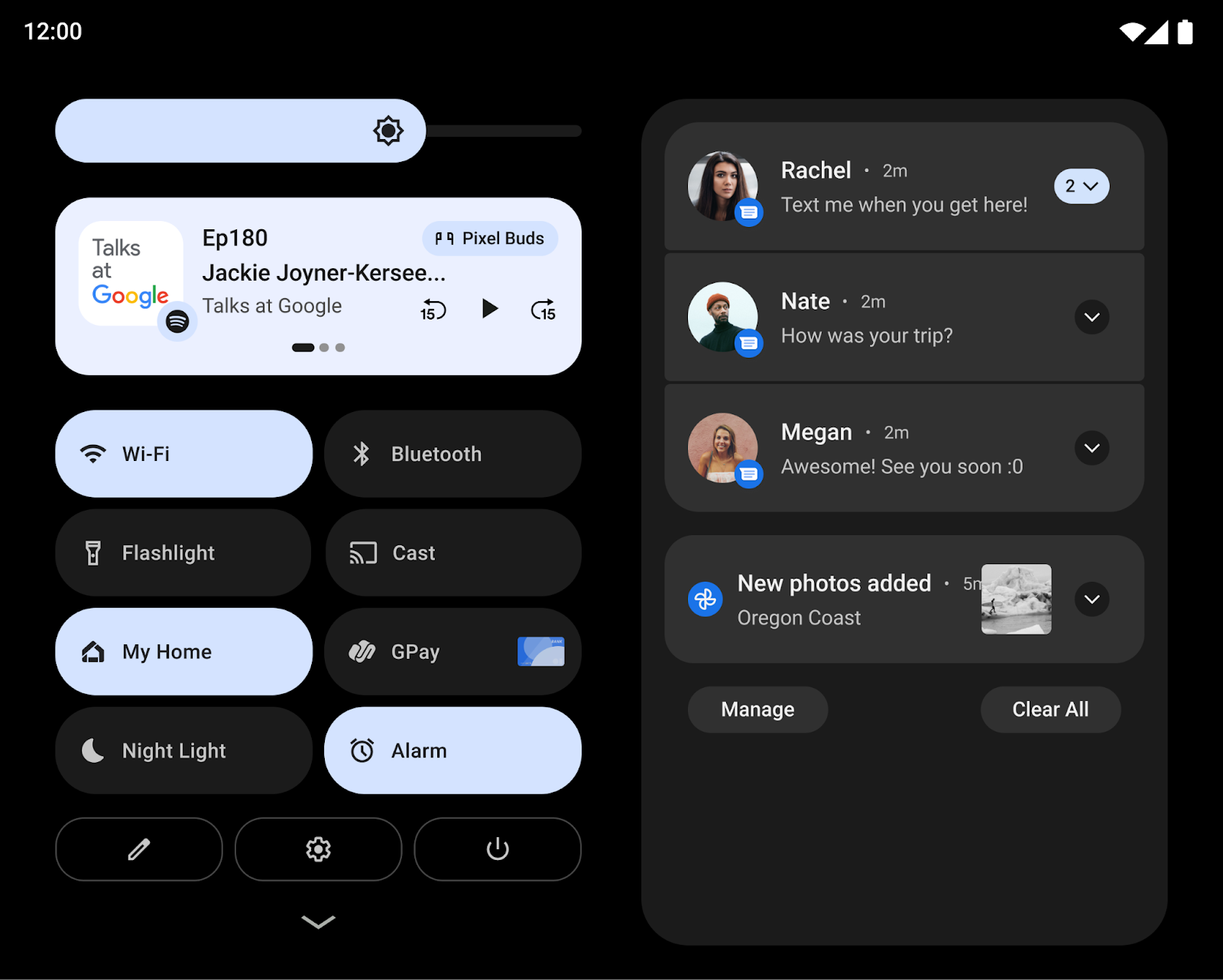
This is what the notification bar will look like on large screens in Android 12L.
How the display will be transformed into two columns instead of one is easiest to show on the application with messages. When the list of contacts remains on the left side, and the correspondence with a specific user in the second.
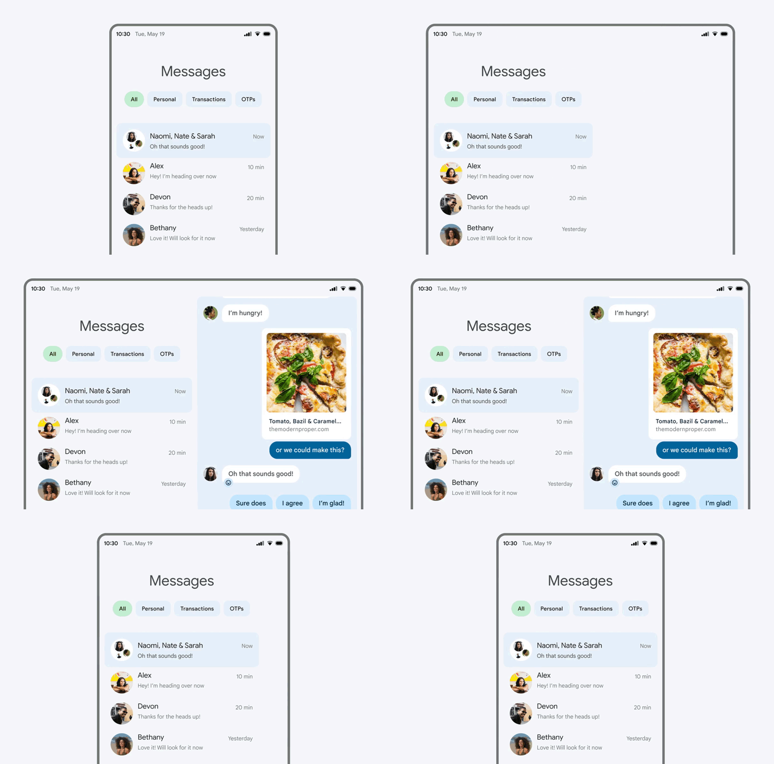
Messenger apps are definitely the first candidates for transformation.
Improving multitasking
These include multi-window, taskbar, drag-and-drop, and split screen. In Android 12L, a taskbar will appear, called up to the screen by pressing and holding your finger. The split screen mode will be activated by simply dragging and dropping the application icon. Now the use of split screen will become available for Android users, regardless of whether a particular application can switch to multi-window mode and resize its window.
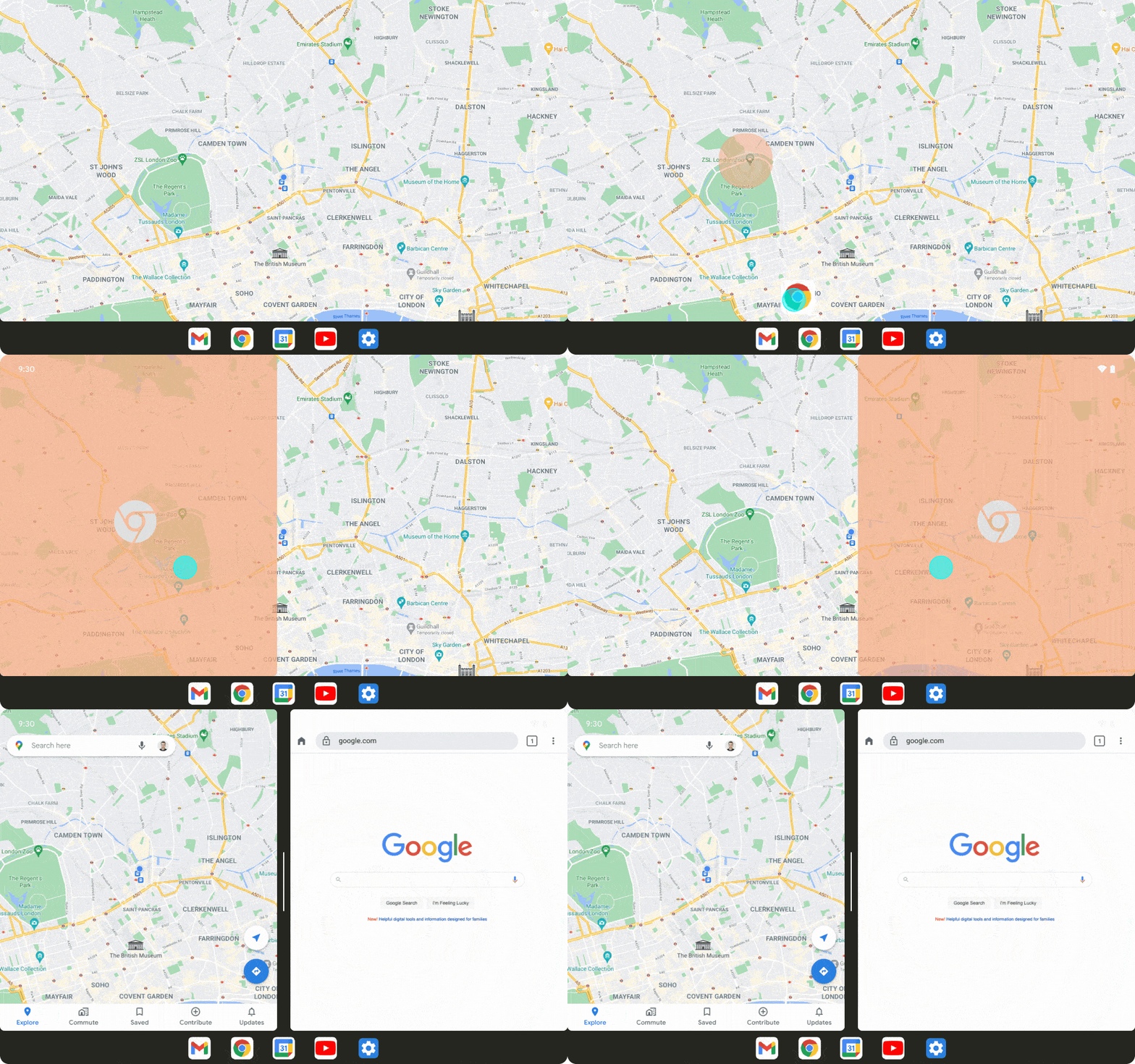
To open the second window on the screen, just drag the application icon from the taskbar
Stability improvements for non-responsive applications
- developers have been releasing versions of their applications adapted for large screens for a long time, but now adaptability will work more stable on applications that have not yet been optimized thanks to a special compatibility mode... That is, if the developers of the application did not take care of what kind of appearance they will have on large screens, such an application will be launched on the smartphone in the unfolded state in a special window so as not to disrupt the operation of the application and not cause it to fall.
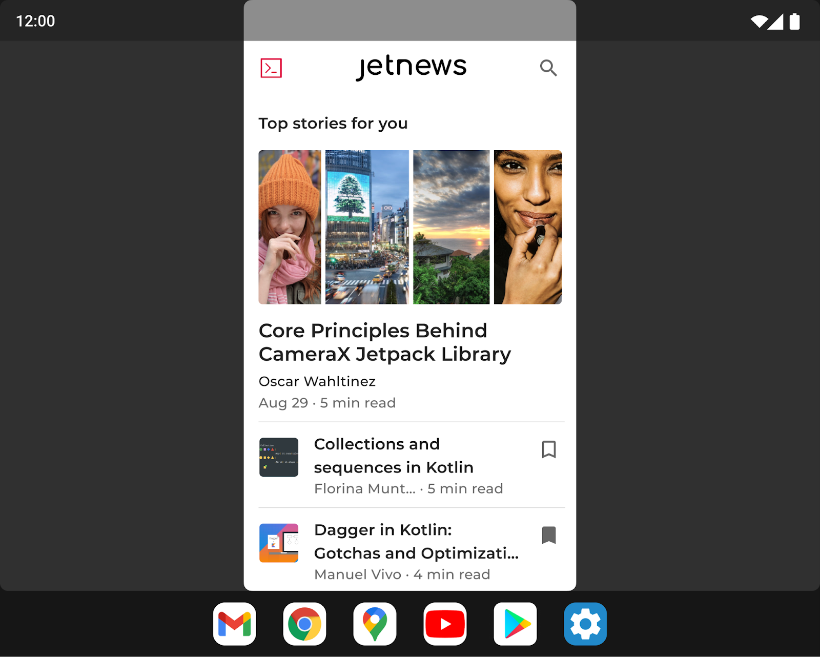
This is what an unoptimized application looks like on the unfolded screen of a folding smartphone.
Device orientation request
If for smartphones most applications have only portrait (or, conversely, only landscape, for example, in games) orientation, then tablets and smartphones with folding screens are often used in both orientations, regardless of the application. Device manufacturers will now be able to override an app's request for a preferred orientation and be able to customize their screens to ignore the orientation specification and force the app to display the desired orientation.
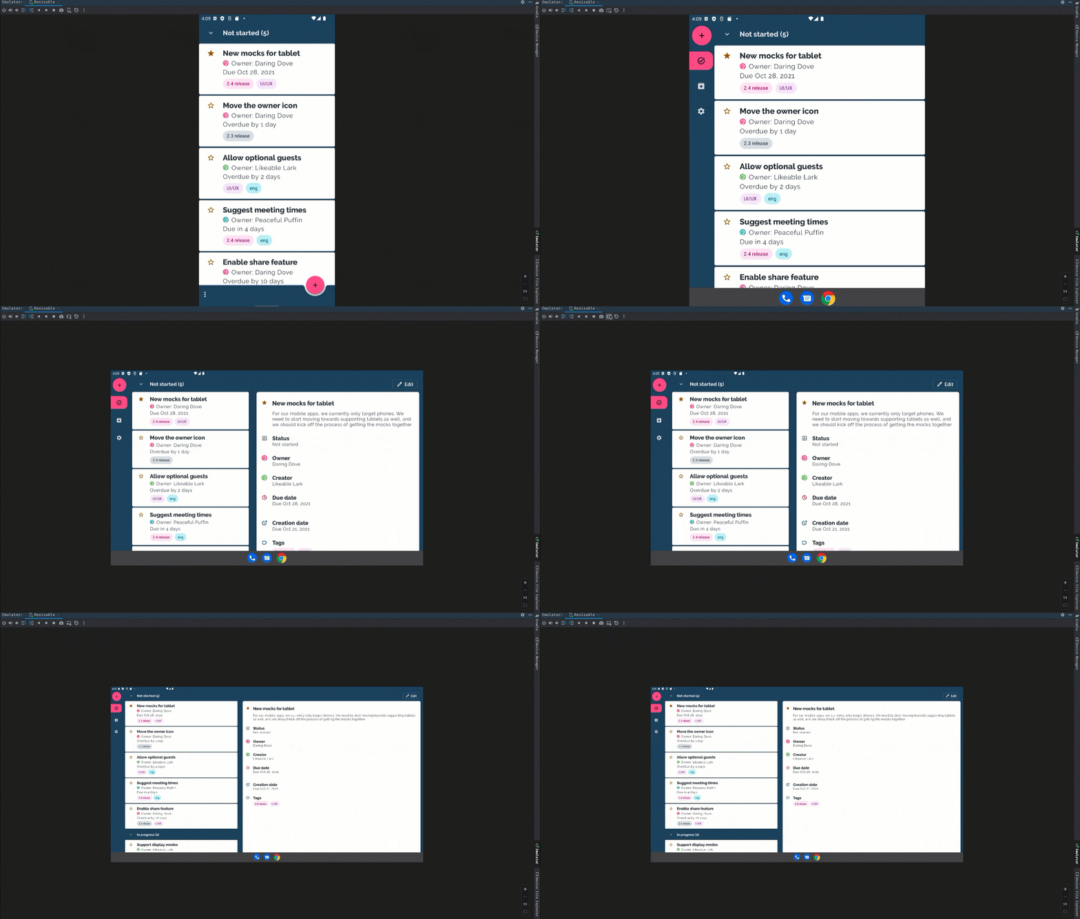
The Android 12L emulator allows developers to see how their application will look on different screens and in different orientations right now.
When looking at all these materials, I did not leave the feeling that I had already seen all this. And this path has already been passed by Samsung, first in the Galaxy Fold, then in the Galaxy Z Fold2, now in Galaxy Z Fold3... That is, Google just waited two years to make sure that the concept of a smartphone in the fold form factor is viable and evolving, and now it legitimizes these developments, making them part of its operating system, and not the manufacturer's shell. And it does this, of course, in order to expand the capabilities of other manufacturers to produce similar folding smartphones (after all, a smartphone is not only hardware, but also software, and not all manufacturers have the financial capabilities of Samsung). Ultimately, this will lead to a reduction in the cost of folding smartphones, which, in fact, plays into the hands of both Google and consumers, and Samsung, in fact, will not lose from this either, being the first to stake out a new growing market segment.
Part 2. One UI 3.1.1: what's new?
One UI update to version 3.1.1 appeared this fall. It introduces drag & split, Multi-Active Window, and control functions for applications that are not adapted to bendable screens: proportion control, full-screen maximization and a unique mode that has not yet been thought of ( or just not voiced by the developers of Android 12L) - split mode, in which the screen is divided into two parts, like a laptop - in fact, the display and service buttons. All of these new features that take advantage of the foldable screen features of all Galaxy Folds are found in a dedicated, experimental section of the Labs menu (Settings - Advanced Features - Labs).
Drag & Split
Of course, the large screen, first of all, allows you to make multitasking more comfortable, thanks to the support of multi-window mode. All this, strictly speaking, we have seen before on Android. I remember that the first was the Samsung Galaxy Note 10.1 tablet, released almost ten years ago, in 2012. Of course, now all this is simpler and more intuitive, but it is worth noting that you need to adapt so that everything works the first time. But the formal result is obvious - you need to click on the link in the document and drag your finger without lifting it from the screen (sounds like a child's game, right?) To the edge of the screen. These capabilities are supported by the pre-installed Samsung applications: Internet (this is the name of the branded browser), Notes, My Files, Messages, MS Office, OneNote and OneDrive.
Multi-Active Window (multi-window mode)
You can place up to 3 windows on the screen, their sizes and placement on the screen can be changed with finger movements (you can also miss - after all, the screen on the Galaxy Z Fold3, on which I did all this, is smaller than on the tablet).
To delete an extra window, you first need to place it on top of the others, and then again "pick up" with your finger and send it to the bottom of the screen - there will appear the "Delete" button. Why it was so complicated is not very clear, but it is obvious that the industry is at the very beginning of the path and will still improve many times (as it was many times before).
Set Aspect Ratio for Apps
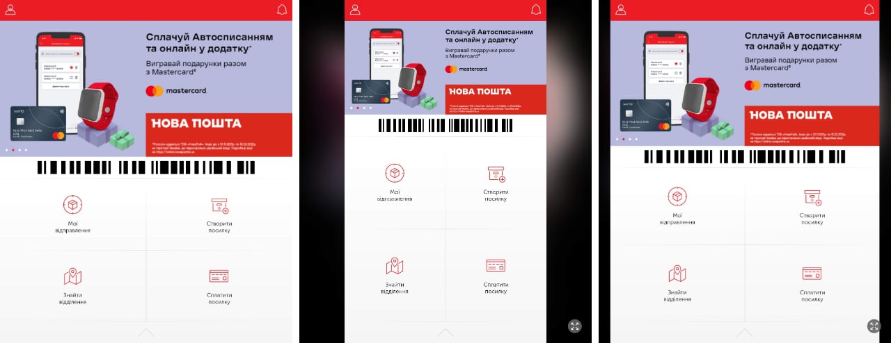
Obviously, the outer and main screens of the Galaxy Z Fold3 have different proportions, so the question inevitably arises - how will applications that know nothing about the existence of smartphones with folding screens be displayed. To do this, in the Labs menu there is a section "Adjusting the proportions of the application". The appearance of the application may change depending on the settings. As an example, I took the Nova Poshta application, which, in principle, is optimized for large screens. But it is worth noting that it is impossible to predict in advance what and how the application will display - the user will have to experiment.

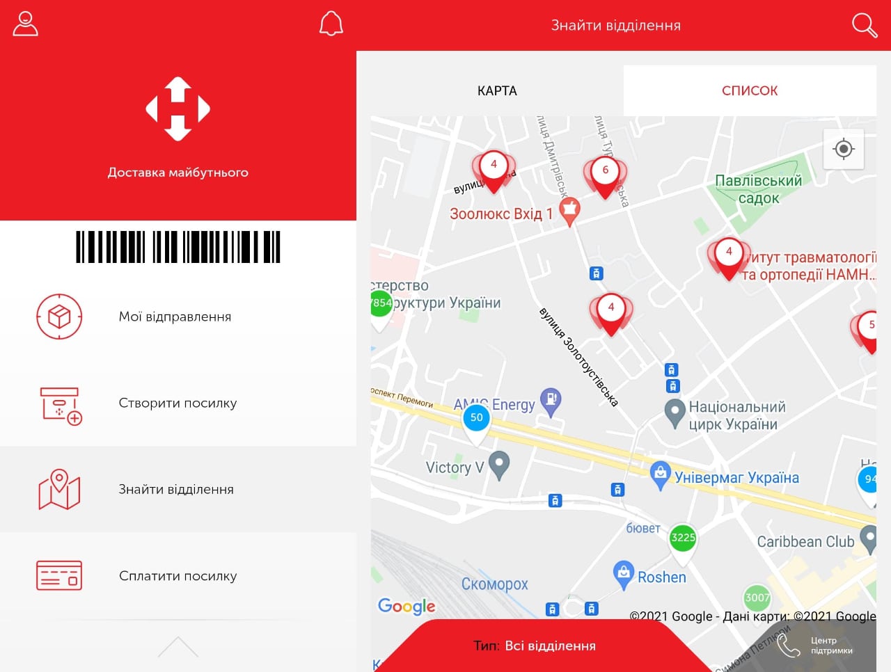
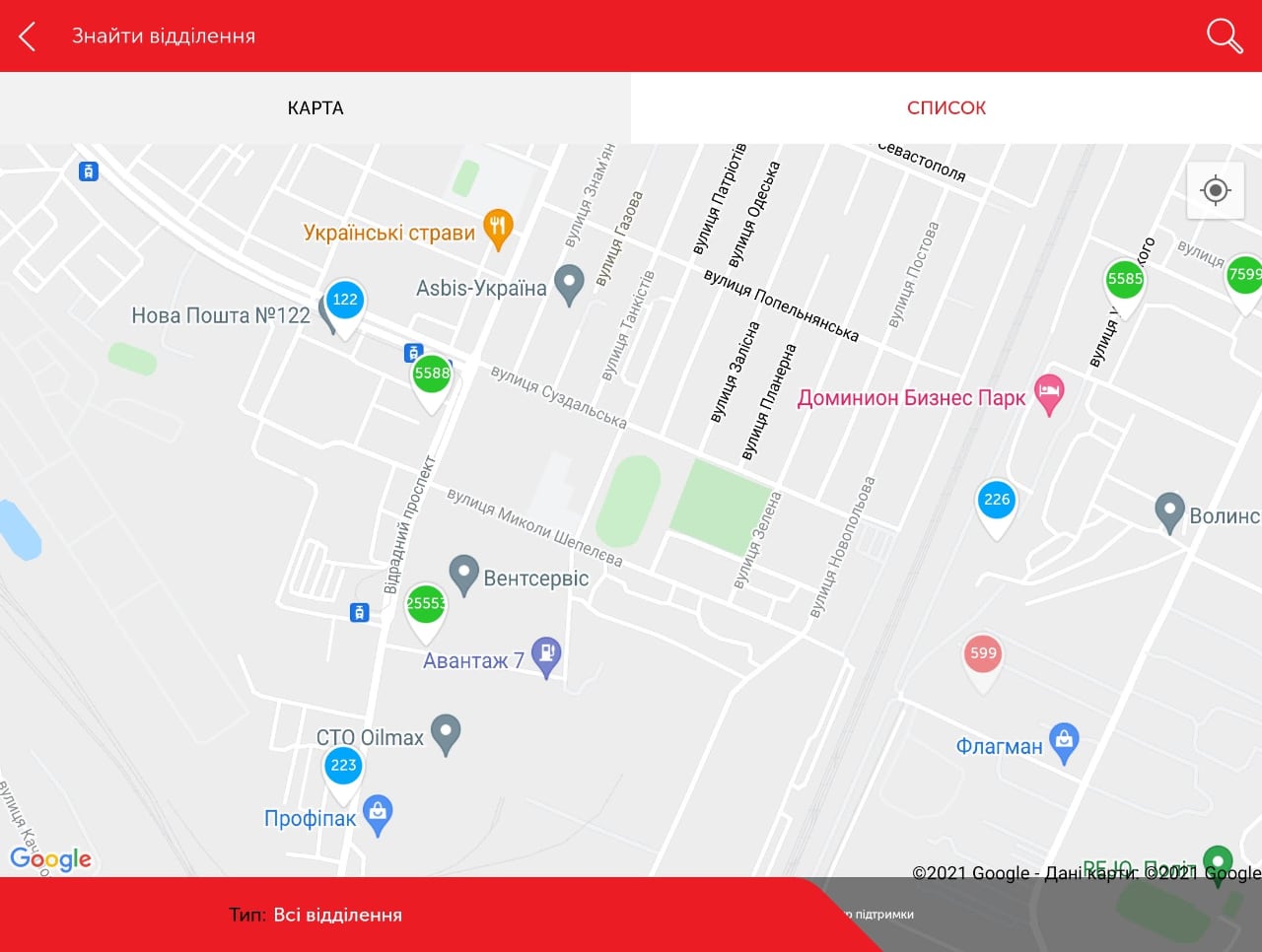
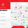
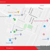
And if everything is more or less clear with the horizontal (tablet) orientation, then in the vertical proportion the application windows will be exactly what they are indicated in the menu, that is, in full screen, 16: 9 or 4: 3. Pay attention to the button in the lower right corner - it appears only when the application is not open in full screen. Depending on the settings of the application, by clicking on it, either the application will open in full screen, or (if the proportions are forced there), it will open the desired section in the application settings menu, where you will need to select the proportions of interest to the user. By the way, by default, the "New Mail" application opens in full screen - it is logical to assume that its developers tested adaptability on large screens.
Flex panel
The most interesting, in my opinion, innovation of Samsung (which Google developers have not yet reached) is the Flex panel and a special Flex Mode, which I wrote about in detail in the Samsung Galaxy Z Fold2 Diaries. In One UI 3.1.1 Samsung developers went even further and offered this mode (also activated for each application in the Labs menu) for any application. in the screenshots below you can see how it looks, but the screenshots are, of course, flat. Just imagine that the bottom and top of it are rotated 90 degrees relative to each other (or at any other angle from 75 to 115). While Samsung offers users 4 buttons in this mode: calling up the smartphone's notification menu (the one that is colloquially called "shutter"), taking a screenshot, changing the brightness and volume. I am sure that in the future there will be a place for developers to turn around, they obviously will not stop at these opportunities, this is only the first step. And now everything looks exactly like an experiment - use cases (and interface elements) have yet to be invented.
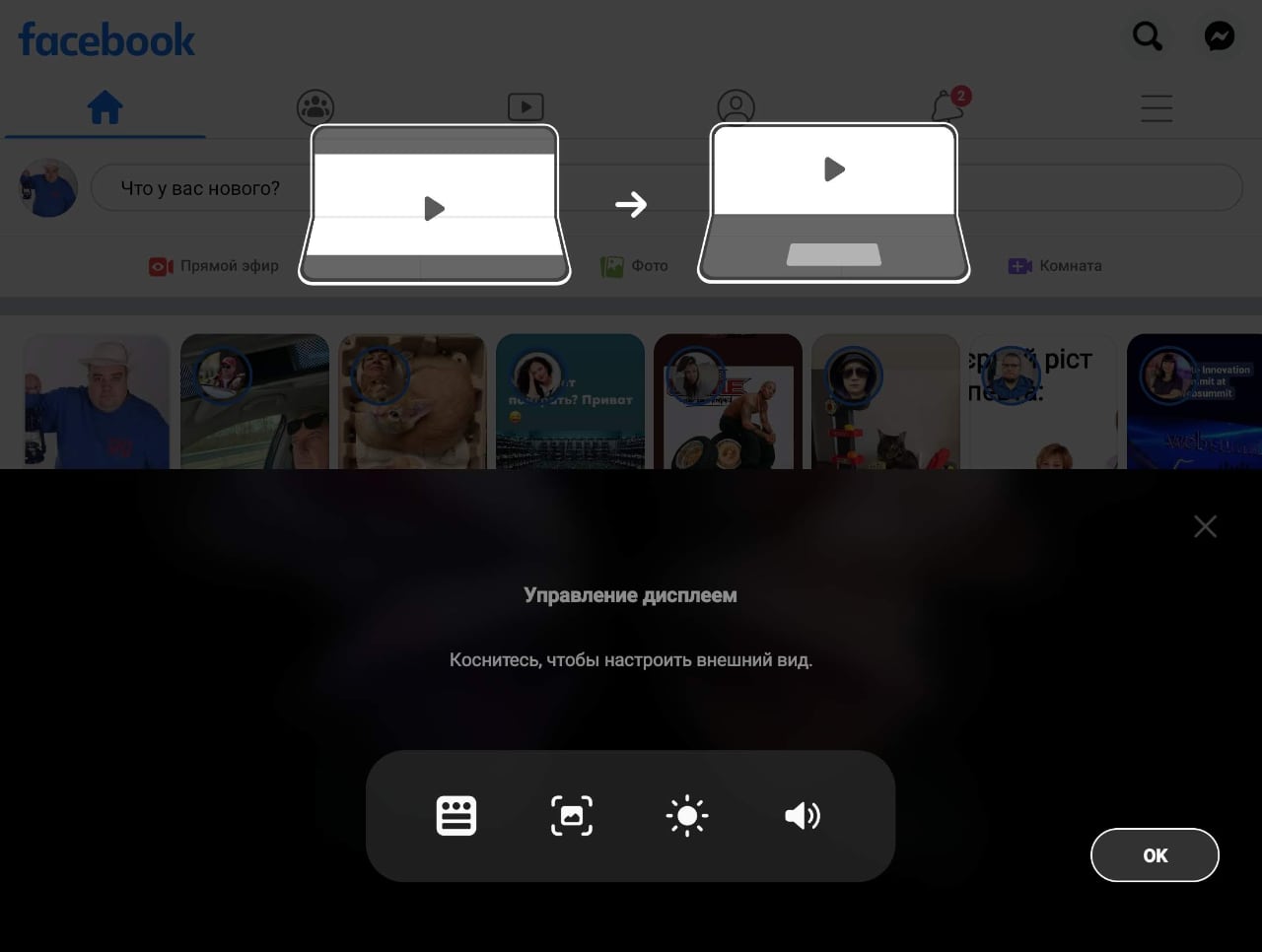
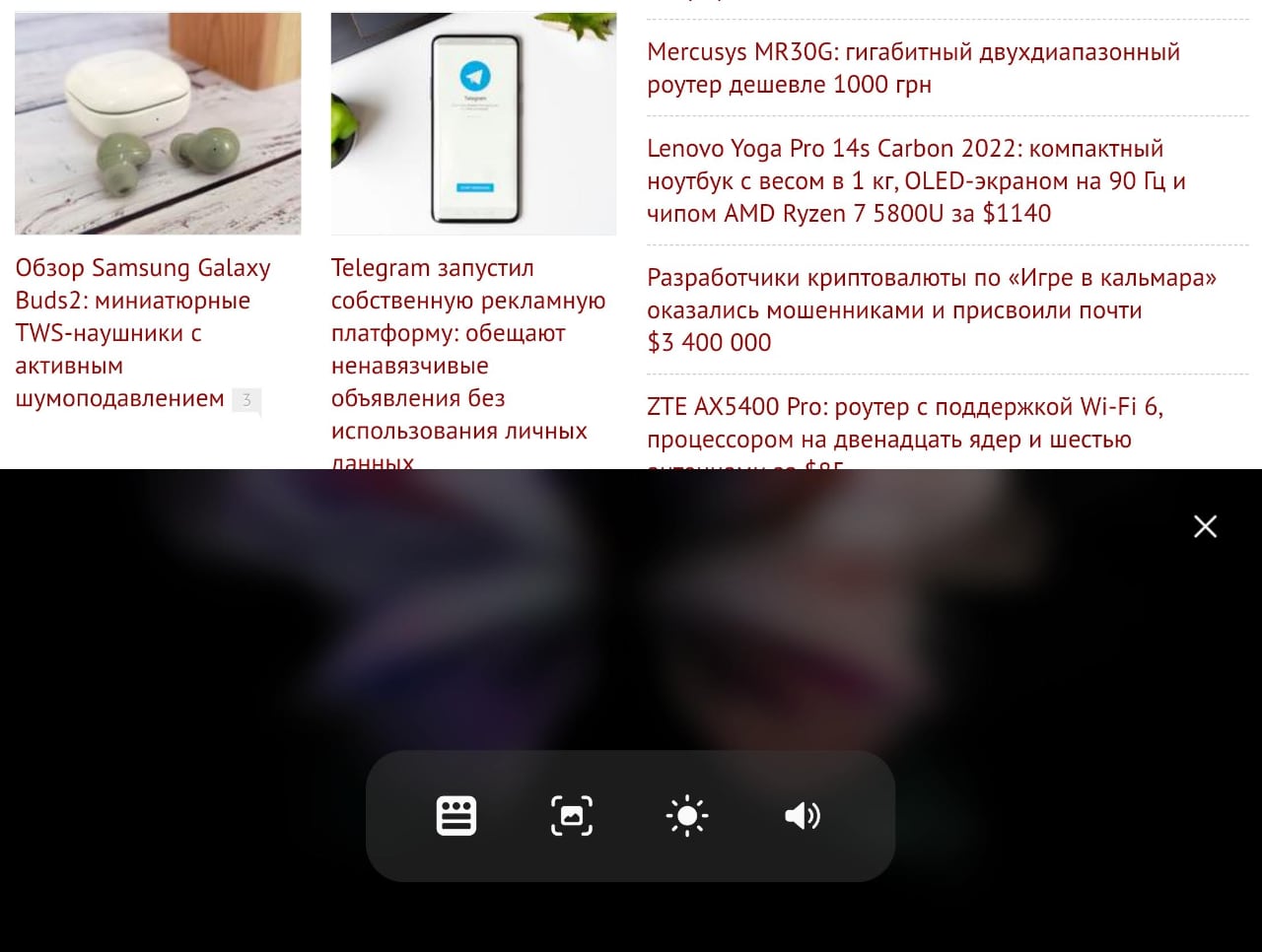
Flex looks more interesting for existing applications. For example, this is how the Camera application looks like (the first screenshot is a smartphone with an open screen, the second is in a bent state, you will have to use your imagination again and imagine that the upper part is bent)
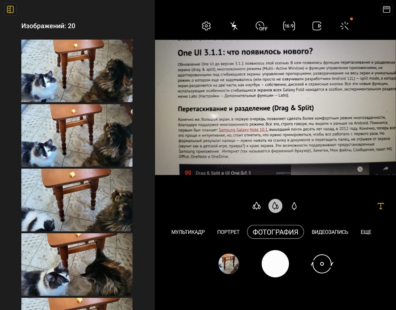
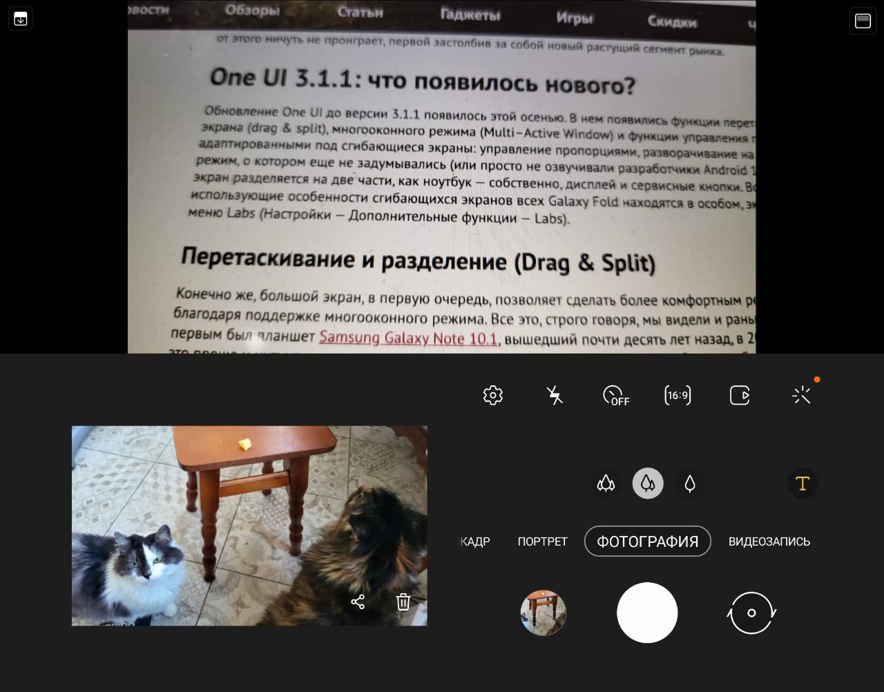
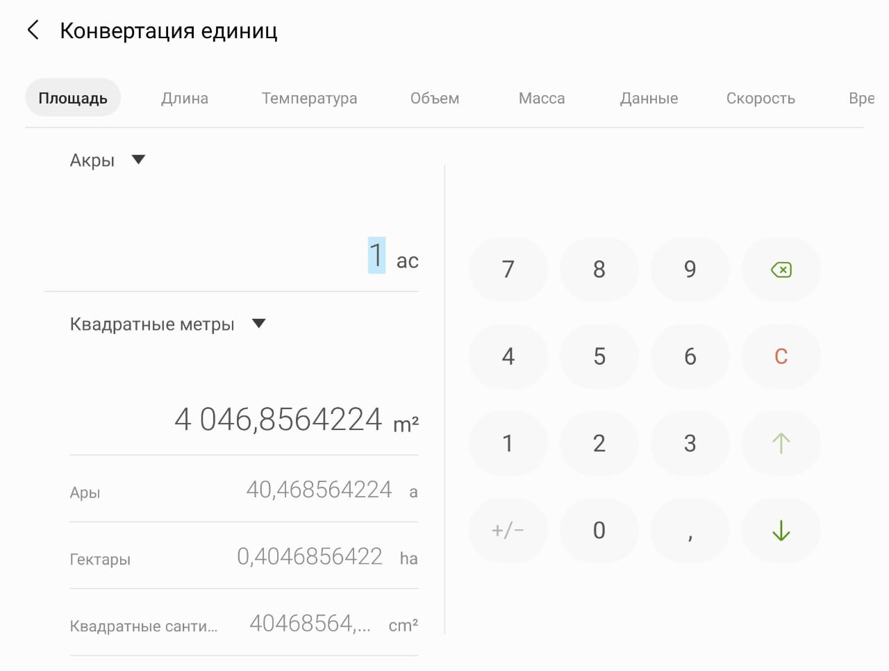
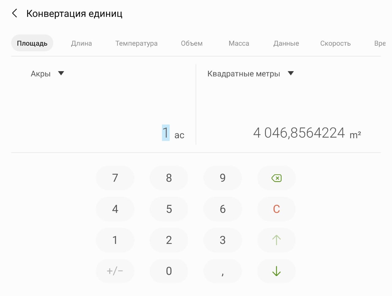
The standard Calendar and Gallery applications still work in this mode. The Calculator looks interesting:
New taskbar
All Samsung smartphones have a useful feature - a separate Edge panel with application quick launch icons. We wrote about this many times (for example, in the Galaxy Note Ultra Diary), but in One UI 3.1.1 it became possible to pin this panel so that it becomes the taskbar, like a computer. Controlling the placement of the panel on the screen (left or right, when changing the screen orientation, it also expands, remaining left or right) and the type of widgets remained in the Edge menu settings. The taskbar can be turned off / hidden at any time and turned into the familiar Edge panel by clicking on the pin icon.
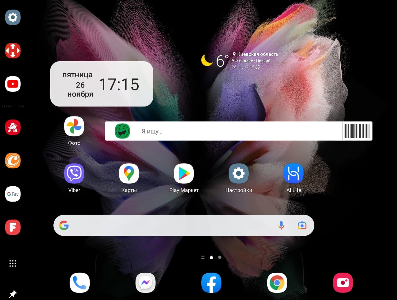
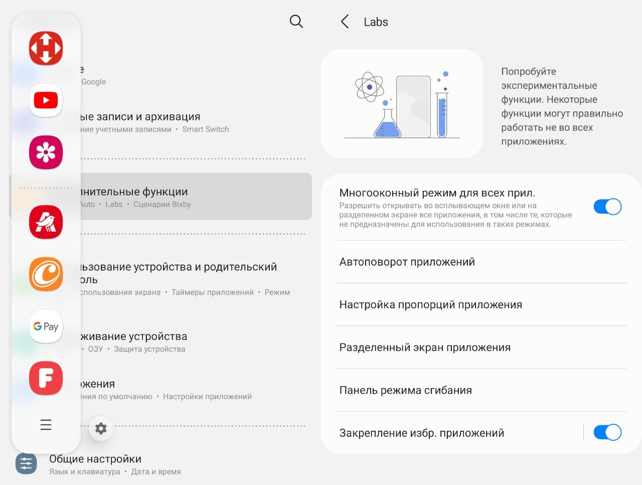
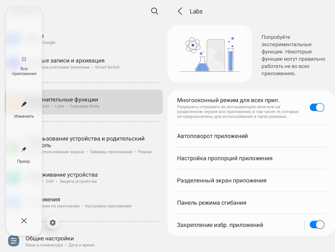
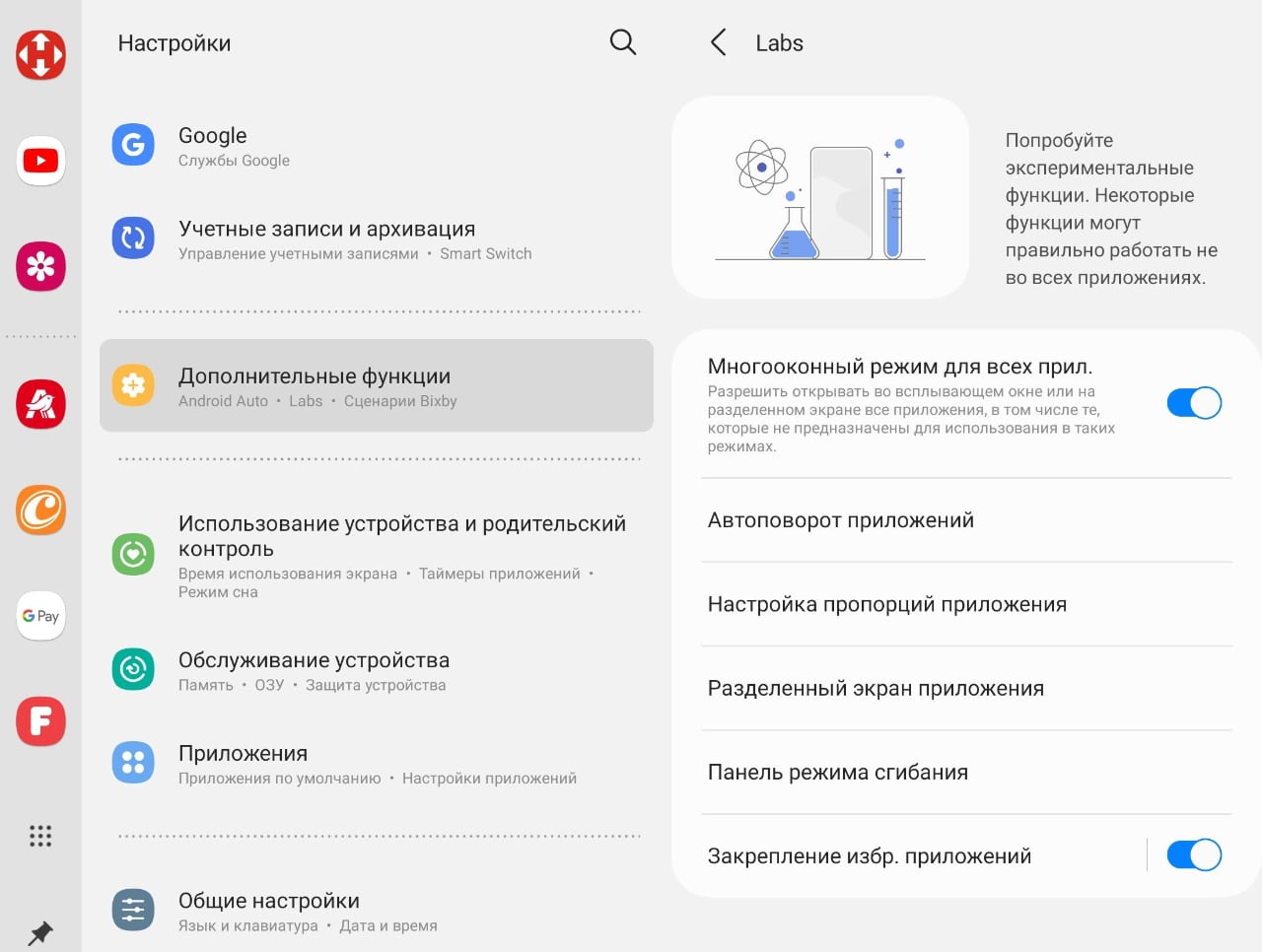
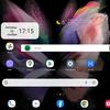
If several widgets are used, then a separate button appears in the taskbar that calls additional widgets that can be scrolled through.

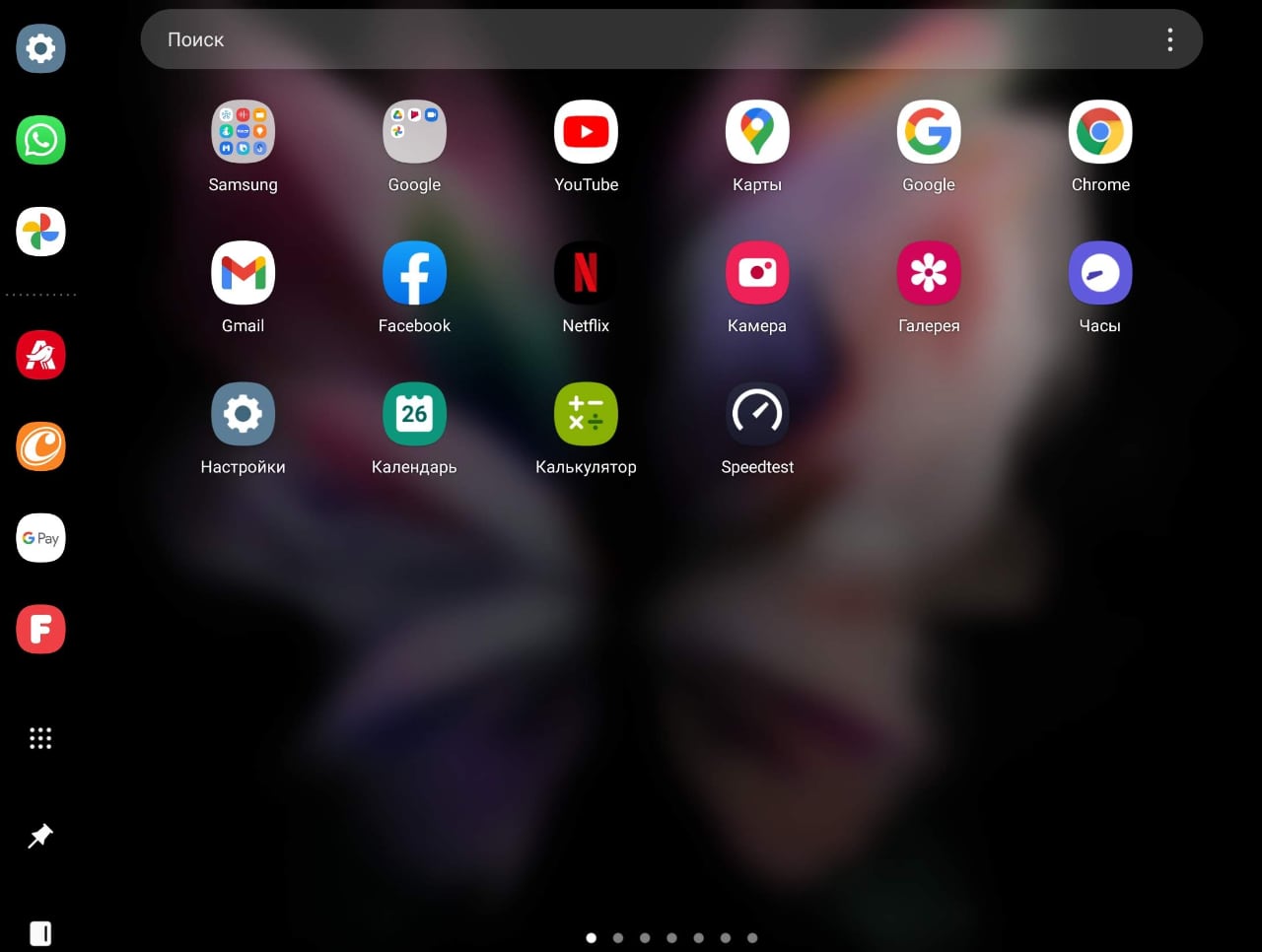
Cover screen mirroring
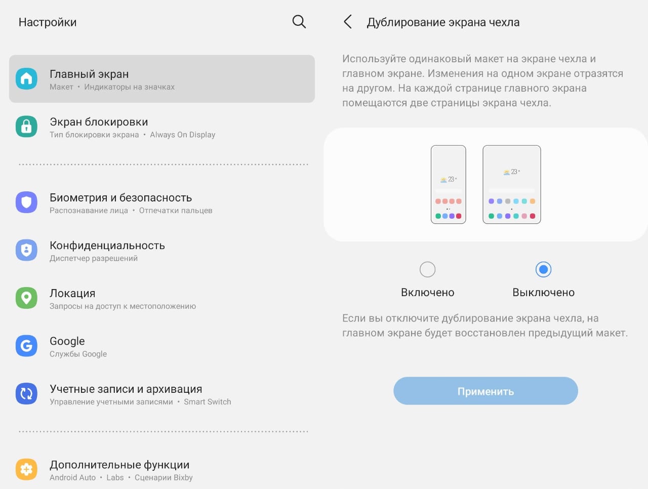
Another innovation of Ome UI version 3.1.1 is the duplication of the external screen on the desktop. This is a simple switch located in the Home screen menu (by the way, in my firmware version the translation looks strange - “duplicate screen of the cover”, in this case cover is not a cover, but an external display).
Actually, the difference between this mode is that a set of icons from two desktops in a closed position is placed on one desktop in the open position. I tried to visualize this difference like this:
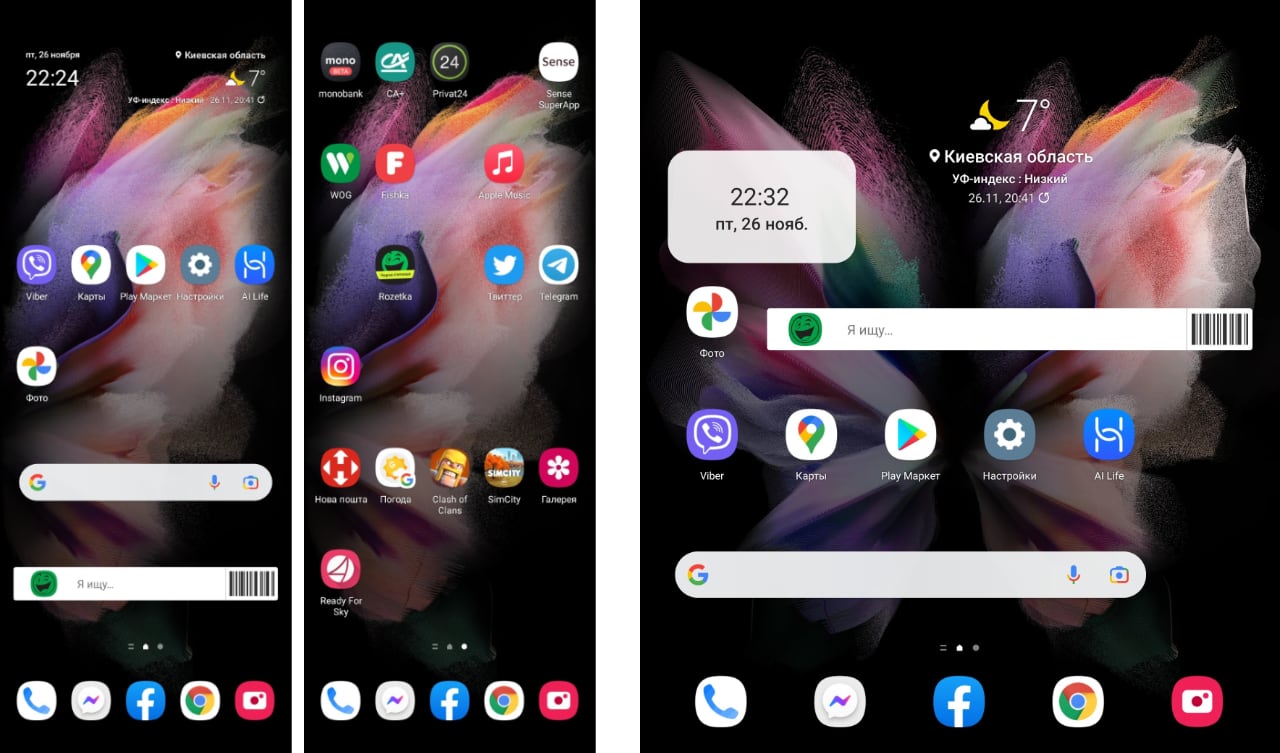
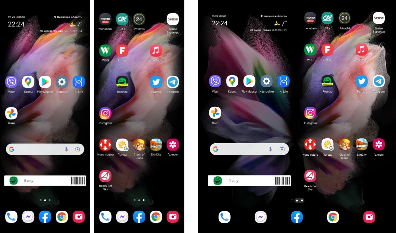
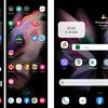
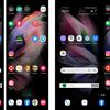
The difference, in general, is obvious: there are twice as many icons on the desktop, which is more consistent with the concept of adaptability, which everyone, in fact, strives for.
Part 3. How convenient is it for the user
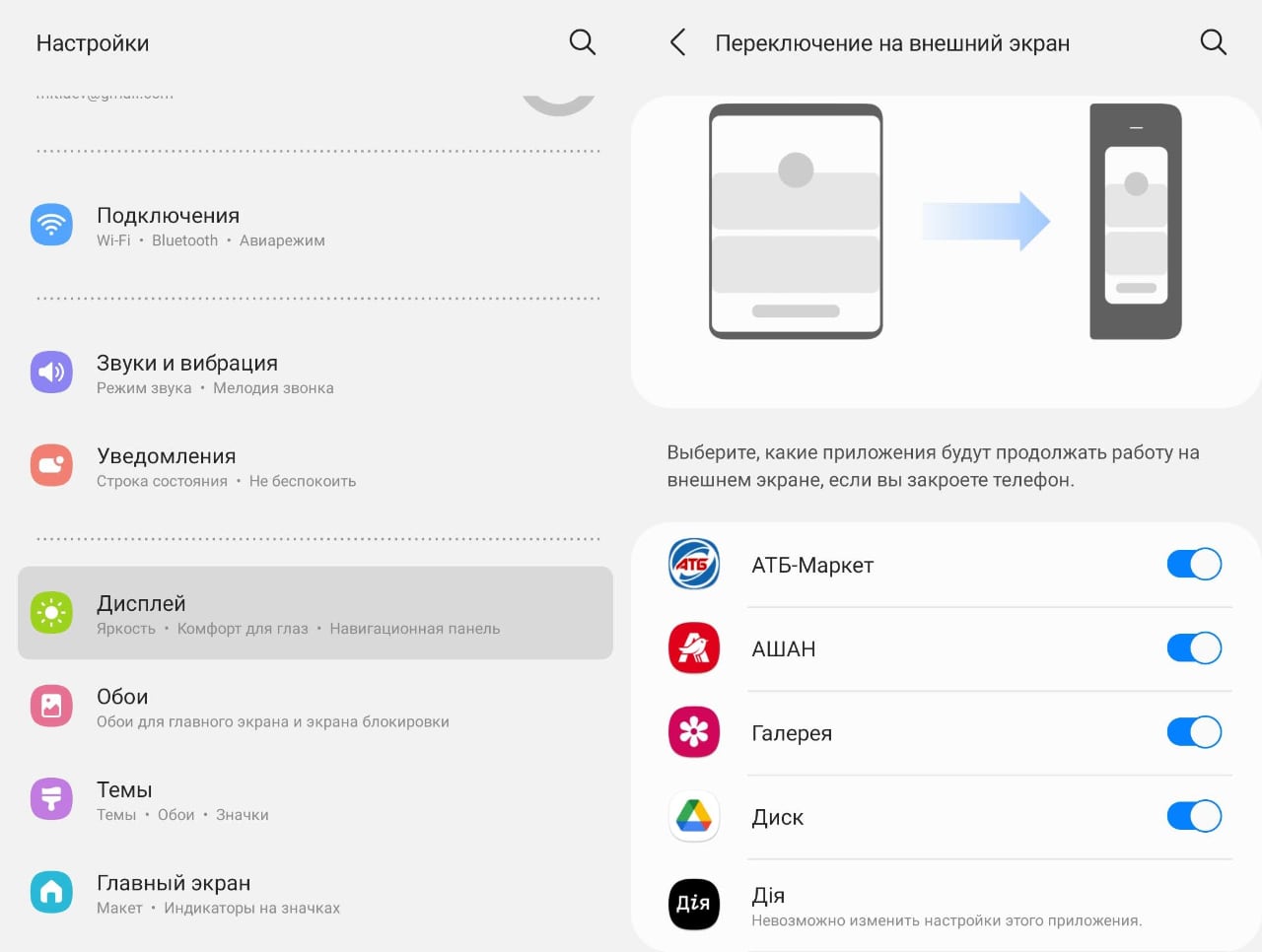
As you would expect, the new dual-display form factor of the Galaxy Fold series of smartphones creates the very new user experience that everyone has been waiting for. Unlike foldable smartphones Galaxy Flip, with which everything is much easier (to simplify, it's just a regular smartphone that can be folded in half), this form factor gives us the experience of working with two devices: an ordinary smartphone (only more elongated - it has aspect ratio 25: 9) and a tablet with an aspect ratio of 22.5: 18. Together with the change of orientation in the open state, this gives three different options for presenting even the settings menu. Actually, that's why Google pays so much attention to all those changes in display orientation and responsive layout. Here's a look at what the Galaxy Z Fold3's menu might look like depending on where we see it (from left to right) - on an external screen or on an internal screen, in landscape or portrait orientation. By the way, this screenshot clearly shows that the best result, with the maximum amount of information placed, is given by an open display in a vertical orientation. But this is when it comes to the menu. For any other application, these results may differ.
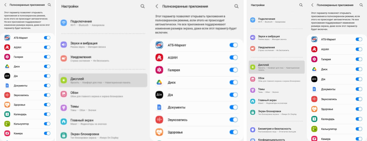
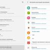
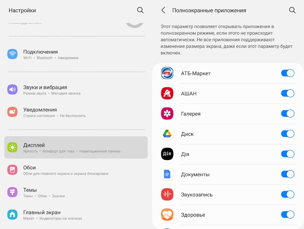
In the display settings there is a separate menu item "Full screen applications", in which you can forcefully specify which applications should be opened in full screen, even if they do not have a version for large and folding screens. I just miss the obvious "select all" button, I believe that it will be added. You can also suggest that such a menu will be for the same purposes in Android 12L (here we return to the topic of our story).
Another section of the menu "Switching to an external screen" useful in real use of a smartphone. It also consists of a list of applications that you want to see on the external screen when you fold your smartphone. It is interesting that for some applications (for example, Diya belongs to them) this feature is still unavailable. And it also lacks the ability to select all applications from the list. With regard to Android 12L, I believe that something like this may appear, if not in it, then in subsequent versions. And in the future, this item will either disappear as unnecessary (and all applications will be displayed by default when the smartphone is closed on the external screen), or, which is more likely, because people are all different, will receive the opposite functionality: only exceptions to the rules will need to be marked. What will actually happen and how this opportunity will develop can be understood only after feedback from users of such smartphones.
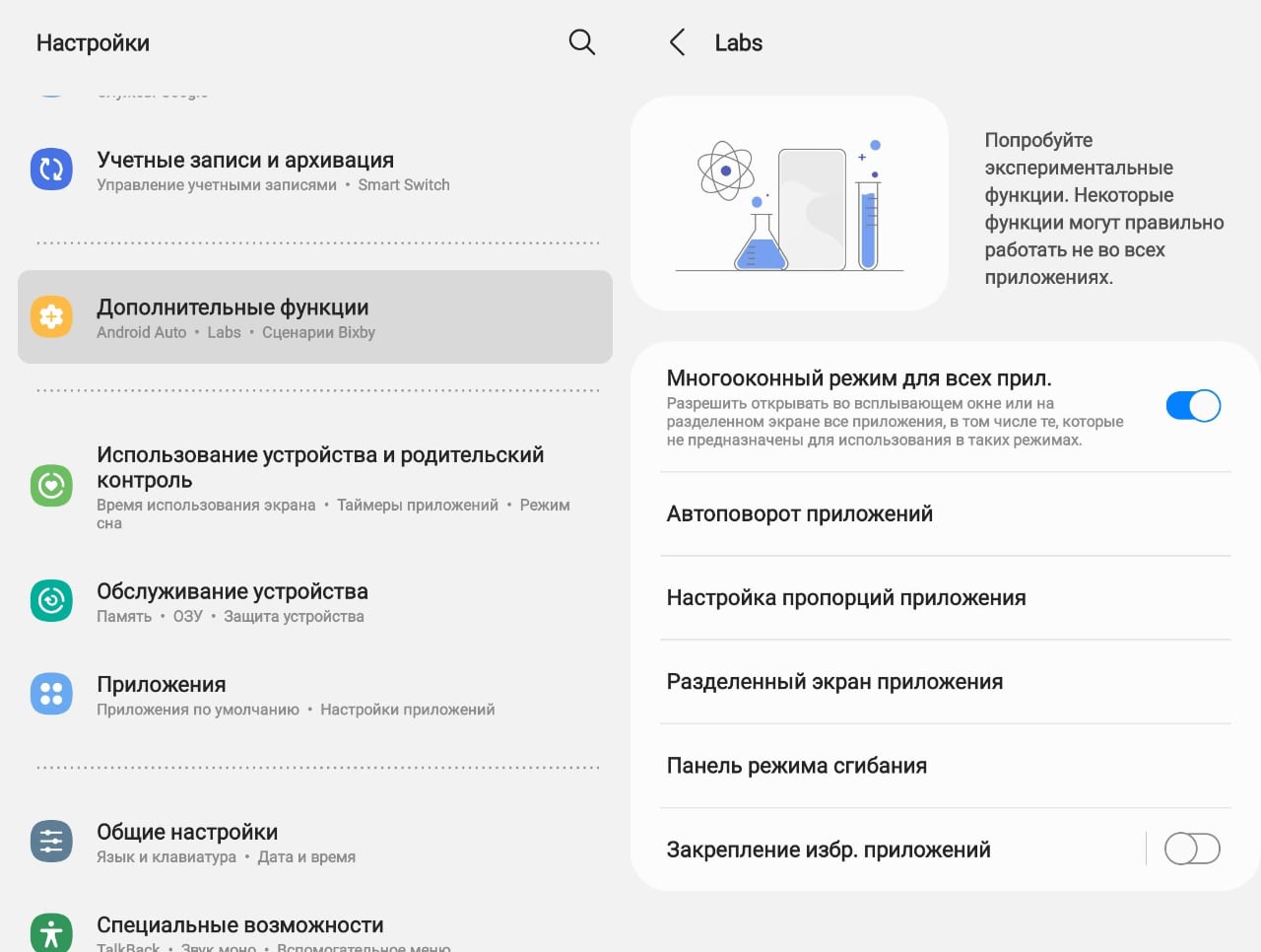
Actually, we talked a lot about the Lab menu, this is how this section looks in One UI 3.1.1. As the name suggests, this is a list of experimental features, the future of which will still be determined by users and how much they will be in demand. You can enable automatic change of display orientation (I think that switching applications to an external screen will also receive such a button to activate all applications in the future), even for those applications whose creators did not take care of two options for the orientation of the screen of their brainchild.
Here you can adjust the aspect ratio of the external screen (the screenshots were above) and the bending mode panel (Flex). The item "Split screen of the application" contained only one WhatsApp, where it was possible to forcibly enable a convenient display in two columns, so I did not focus on it in the description of the new features of version 3.1.1. Finally, the switch "Fav. Applications ”is used to activate the taskbar described above. If this item is disabled, then it cannot be pinned to the screen and the user is left with only the usual Edge panel.
Speaking about the usefulness of all these innovations, it should be noted that the multi-window mode is still crude and requires improvement. Indeed, how convenient is it for the developers themselves to use sites in such three windows? In theory, Samsung says that this is convenient when choosing products - in one window you have a list of products, in the other you open pages with specific products. Well, this is how this scheme of working with the Rosette looks like. It is difficult to assess why it is better than a browser open to the full screen with several tabs. At the same time, the obvious solution - to reduce the size of the system fonts - simply does not work (here, in the screenshots, the fonts are set to a minimum, you still can't see anything).
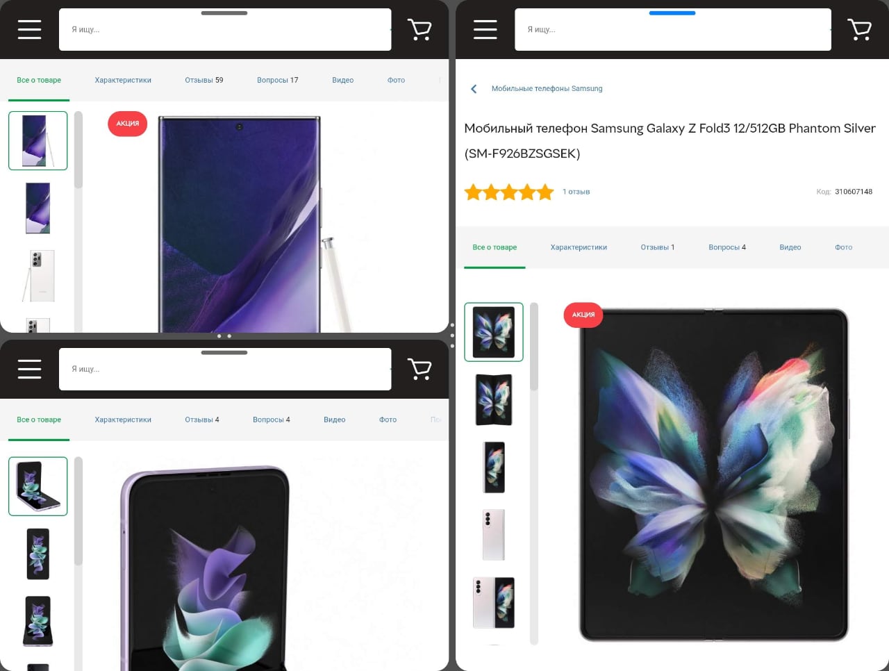
Nevertheless, I still see the prospects for the development of multi-window interfaces on tablets and smartphones with a folding screen. Someday they will still be useful to someone. The smartphone industry with flexible screens is just getting started.
In the dry residue
So, thanks to Samsung, you can understand what exactly Google will put into the Android 12L operating system, you can understand today. The capabilities of the Galaxy Z Fold3 allow today to evaluate how Android will work with applications on a folding screen and where efforts are directed to educate developers: they need to pay attention to the adaptability of interfaces, the ability to use a two-column view, and the application on a large screen as in a portrait. and landscape orientation. At the same time, Samsung has already gone even further - the company's developers are thinking about what the application interfaces will be that will allow you to use all the advantages of bending screens and their state when open, in the manner of a laptop (or an electronic notebook, which will be a more accurate analogy) of the display. Android developers also need to think about seamlessly switching between screens when closing or opening a smartphone, which is also an integral part of the customer experience. But to take advantage of all these capabilities, Android 12L will be (at least until the first half of 2022) nowhere, except smartphones from Samsung itself. Because, in fact, there are no smartphones from other manufacturers with such screens on the market yet.
For those who want to know more
- Samsung Galaxy Z Fold3 Review
- Samsung Galaxy Z Flip3 review: best foldable smartphone of the year
- The most in-depth Samsung Galaxy Z Fold 2 review: a distant cousin of the Nokia Communicator
- Samsung Galaxy Fold review: a glimpse into the future
- Samsung Galaxy Z Flip review: clamshell phones return with flexible displays
