Vivo X80 Pro design highlights the cameras in an awkward way

There are many options to focus the camera on your smartphone, but some designs really stand out.
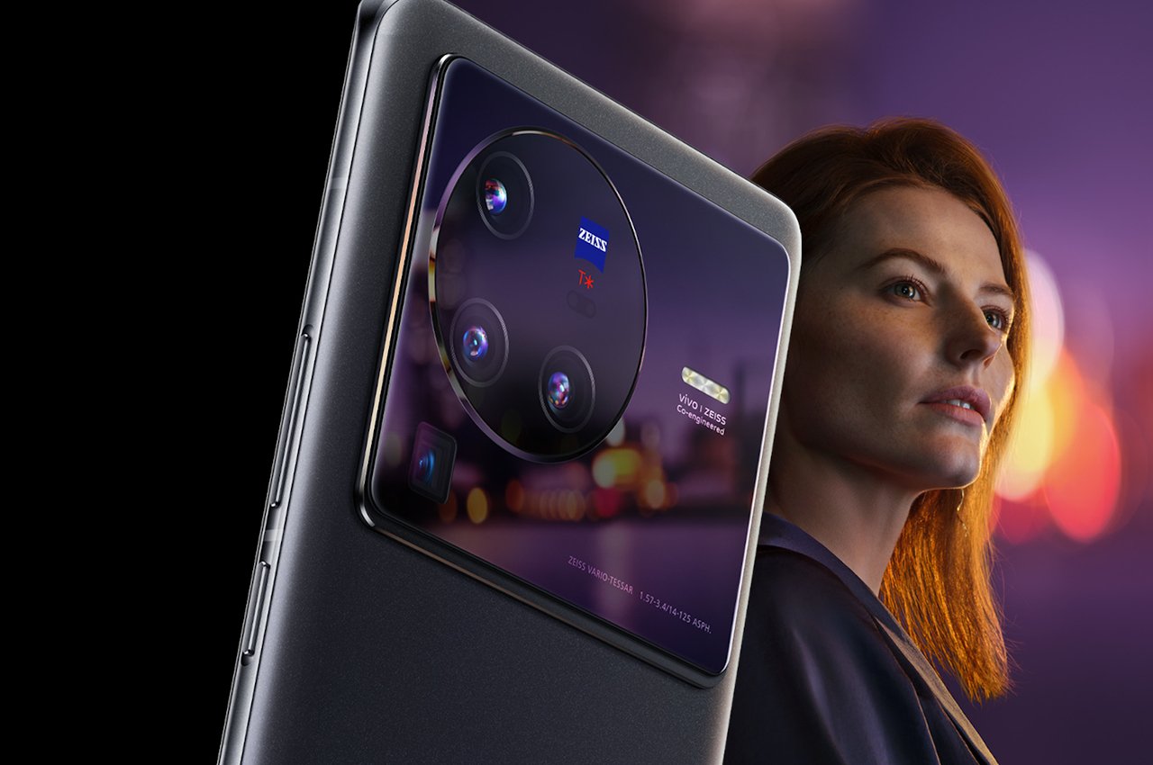
While Samsung appears to be focusing on making foldable smartphones more accessible and saleable in mainstream markets for its products, other manufacturers continue to take advantage of the popularity of mobile photography cards that have not lost their luster over the years. Hardware for these cameras continues to impress with new technologies and features that try to outdo or at least match those on professional cameras. In order to emphasize the role these cameras play, some phone makers have embraced designs that make the lenses the visual focus of a phone’s back. In some cases, the strategy works, but there are also instances like the Vivo X80 Pro that does have you staring at that camera bump, but probably not in a good way.
Designer: Vivo
In general, there are two ways to call attention to something. Either you make the object so stunning that everyone stops and marvels, or make it so confusing that they are left wondering. To be fair, the Vivo X80 Pro’s camera design isn’t on either extreme, but its “circle in a box” takes its oddest turn here. The phone doesn’t just talk.
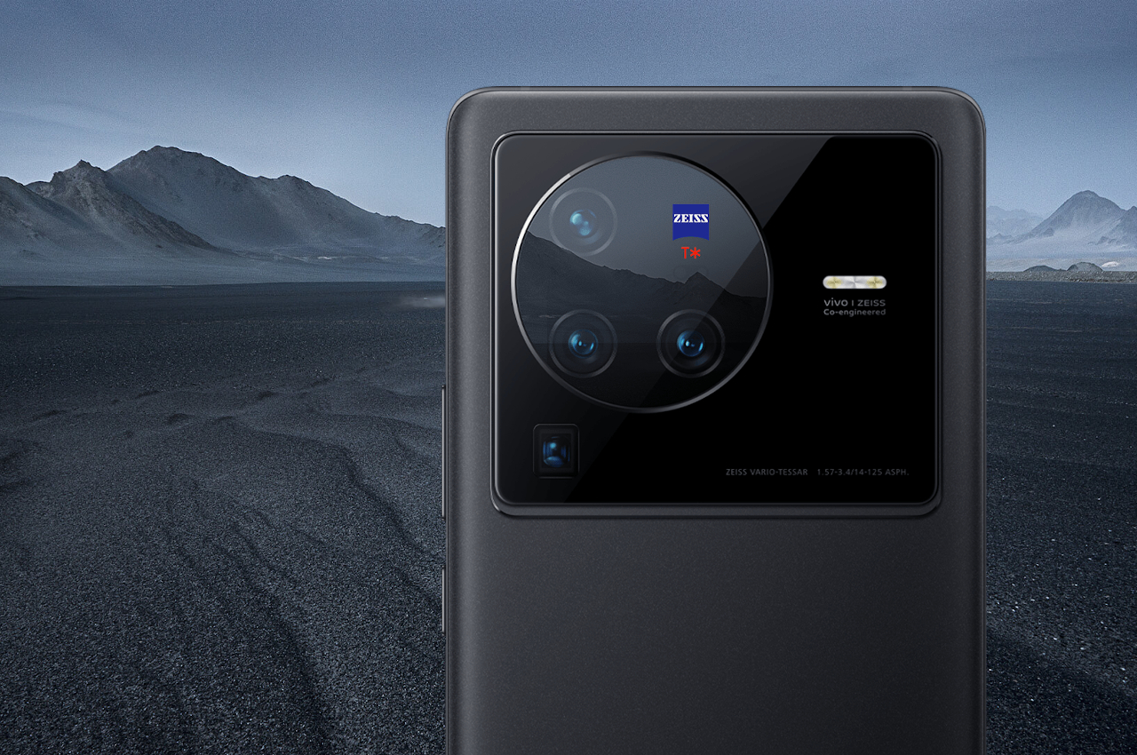
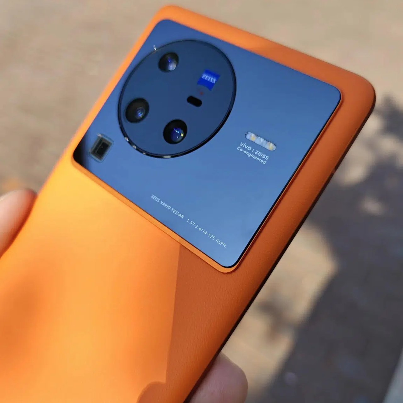
Vivo likens this motif as resembling traditional cameras, where the lens is enclosed in a circle that’s a bit off-center of a larger rectangular box. Of course, a camera’s lens and sensor are more in the middle, and the entire camera design is well-balanced despite how some parts look larger and longer than others. The camera must be balanced ergonomically, otherwise it can be hard to use and hold, even with one hand.
In contrast, the Vivo X80 Pro’s camera design seems to revolve around the idea of asymmetry and imbalance. Although it has used this motif in other models, like the Vivo X Note, the Vivo X Fold, and the non-Pro Vivo X80, it looks more awkward and almost cluttered here with more elements to accommodate. In order to keep the design consistent between those four 2022 models, Vivo opted to keep the “extra” 8MP periscope telephoto camera out of that circle. This means that the rectangular island is much wider than the circle, allowing for the square lens to be placed on its own row. It’s not as tight as the other models that fit tightly on the bottom and top edges of the enclosure.
Even the position of that periscope camera itself is awkward and could trigger some people with OCD tendencies. It sits on its own, not aligned with any other visual object horizontally or vertically. It’s almost as if the designers couldn’t really decide where to place the camera best and just used an empty space there. For the record, the right side of the camera array is nearly empty save for the LED flash and branding. While there are arguments for making good use of white space in certain cases, wasted space is also an issue.
To its credit, the Vivo X80 Pro seems to at least deliver all the photography prowess it promises, and owners will be more focused on taking photos and recording videos rather than staring at the cameras on the phone’s back. That said, Vivo could have probably done better, especially to maximize the space it can use, even if it meant deviating a bit from the Vivo X80 and their cousins. Then again, Vivo could have also done worse, like the Honor Magic 4 Ultimate and the upcoming Xiaomi 12 Ultra, both of which put a large wart with many holes in the middle of the phone’s back face.
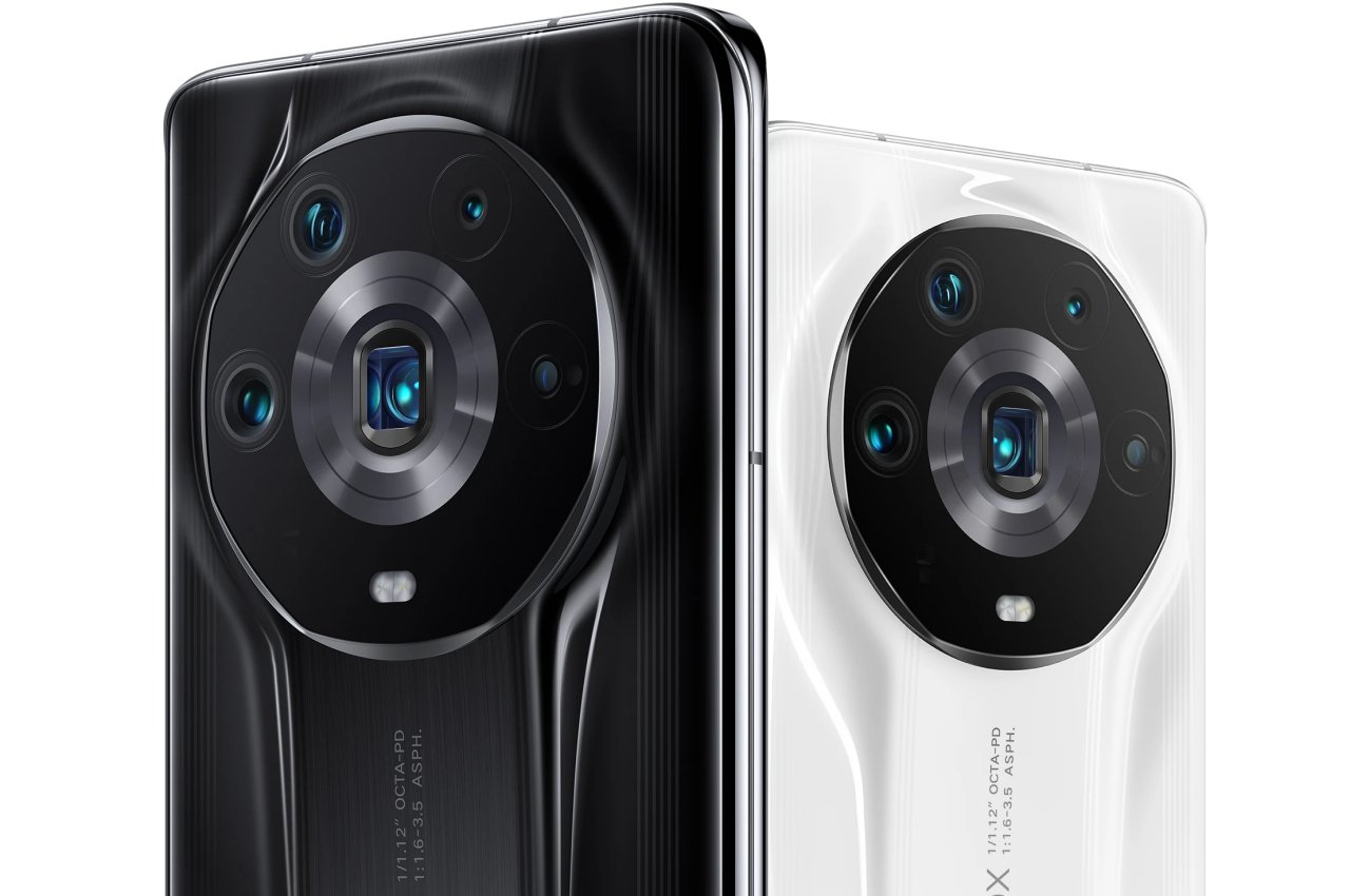
Designer: Honor
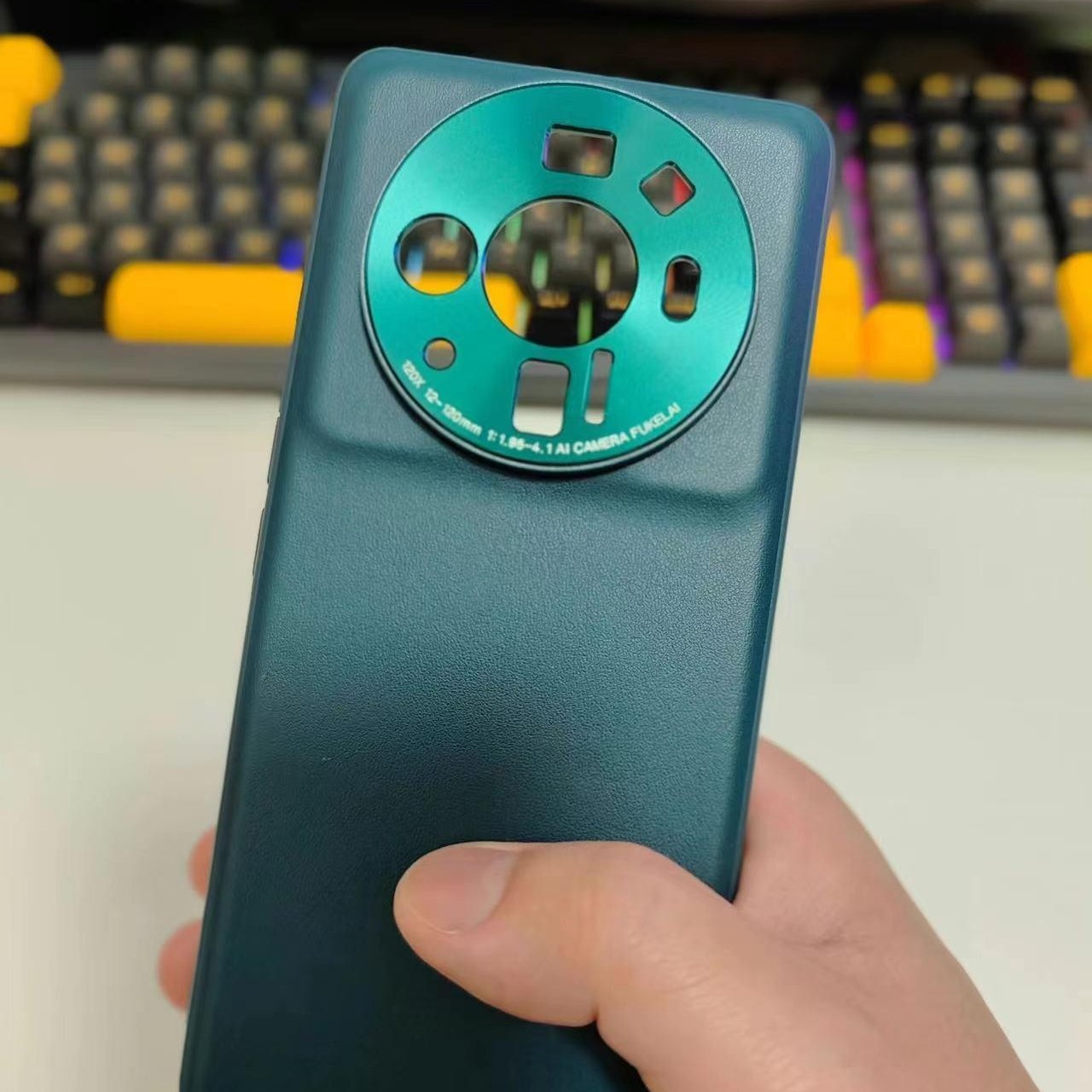
Designer: Xiaomi (via /LEAKS)
Source: www.yankodesign.com