Metacritic has updated its website design: all pages and sections have been changed

Metacritic, one of the most popular aggregators of ratings for games and films, has updated its design. Now it has become more "modern".
Here's What We Know
Metacritic has updated absolutely all sections, starting from the main page and ending with the "best games ever" section.
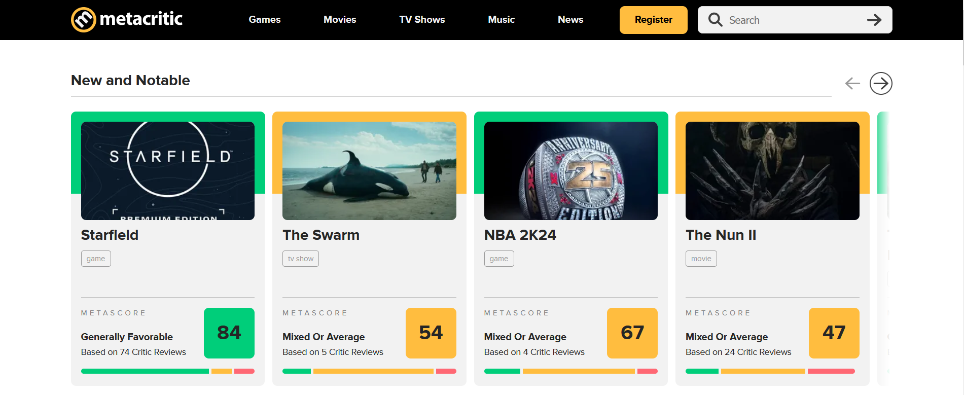
On the home page, we are greeted by the "new and interesting" section, which shows the most discussed games, films, and TV shows. As for games, you can immediately see the critics' scores and the number of reviews. If a game, for example, has received high marks, it will have a green box around it.
The pages with games or movies have changed dramatically. When opening any project page, we see a video almost full-screen, with ratings from players and critics on the side. The ratings are shown for the platform with the most reviews. To see other platforms, just click "view all platforms" on the side.
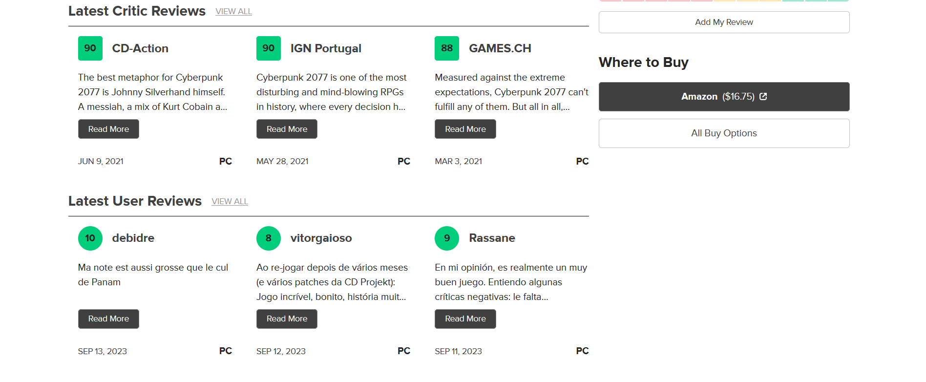
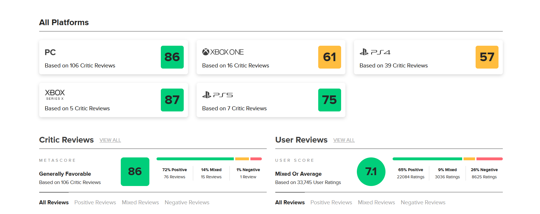
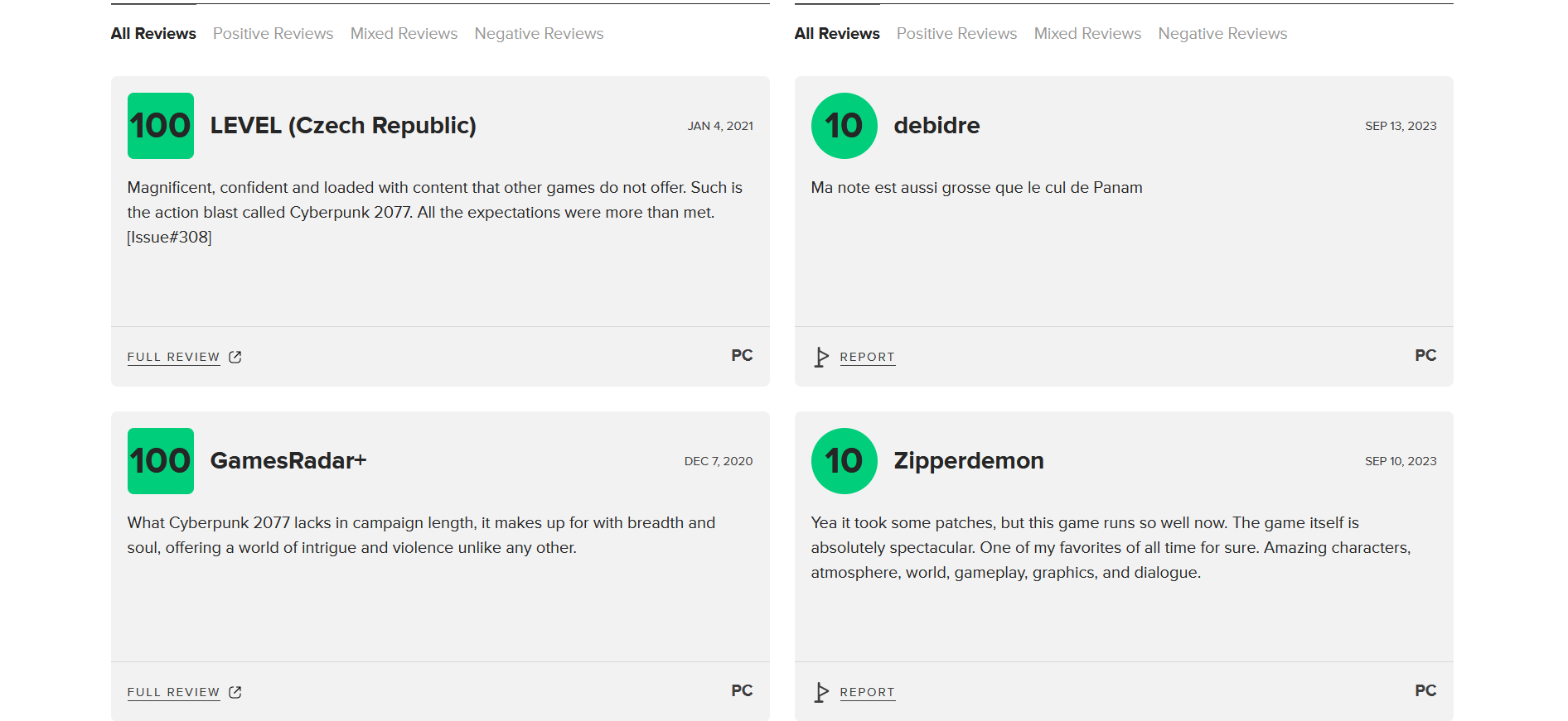
Scrolling down, you will see the three most recent reviews from critics and players. Below that, you'll find a list of all platforms with ratings, and then a section with all the reviews from players and critics.
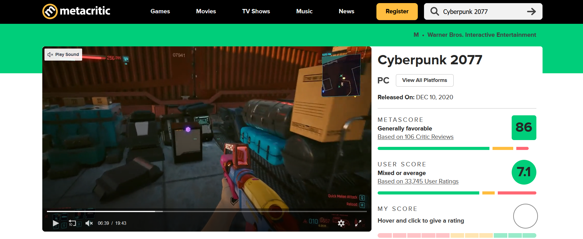


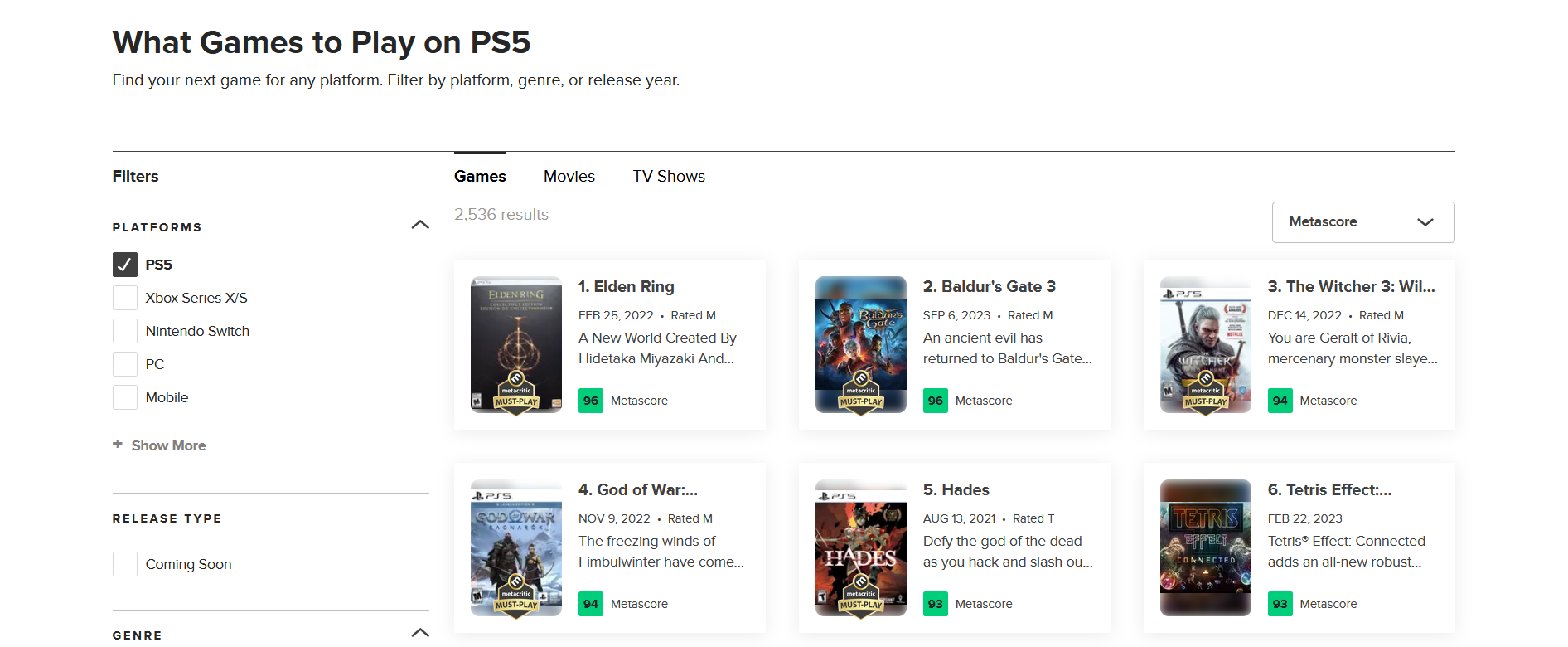
Game page
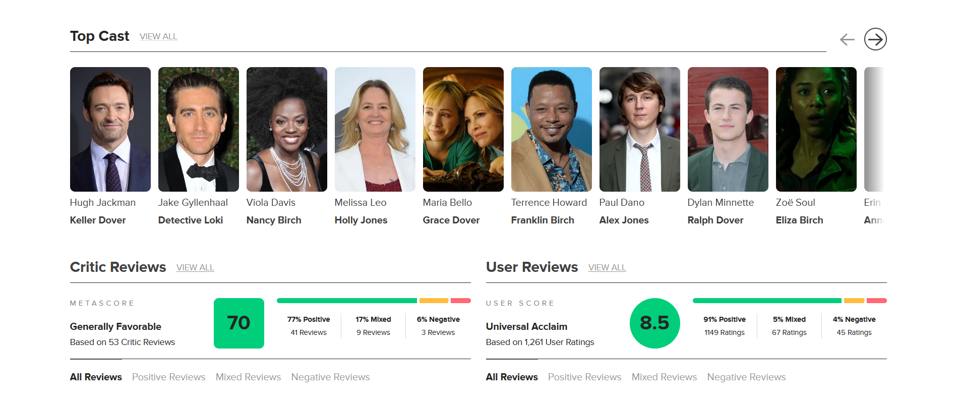
Film pages are slightly different from game pages. For example, you can immediately see a short description of the film, the name of the director, below you can see the cast, and at the end there is a table showing the duration, genre, rating, and awards.
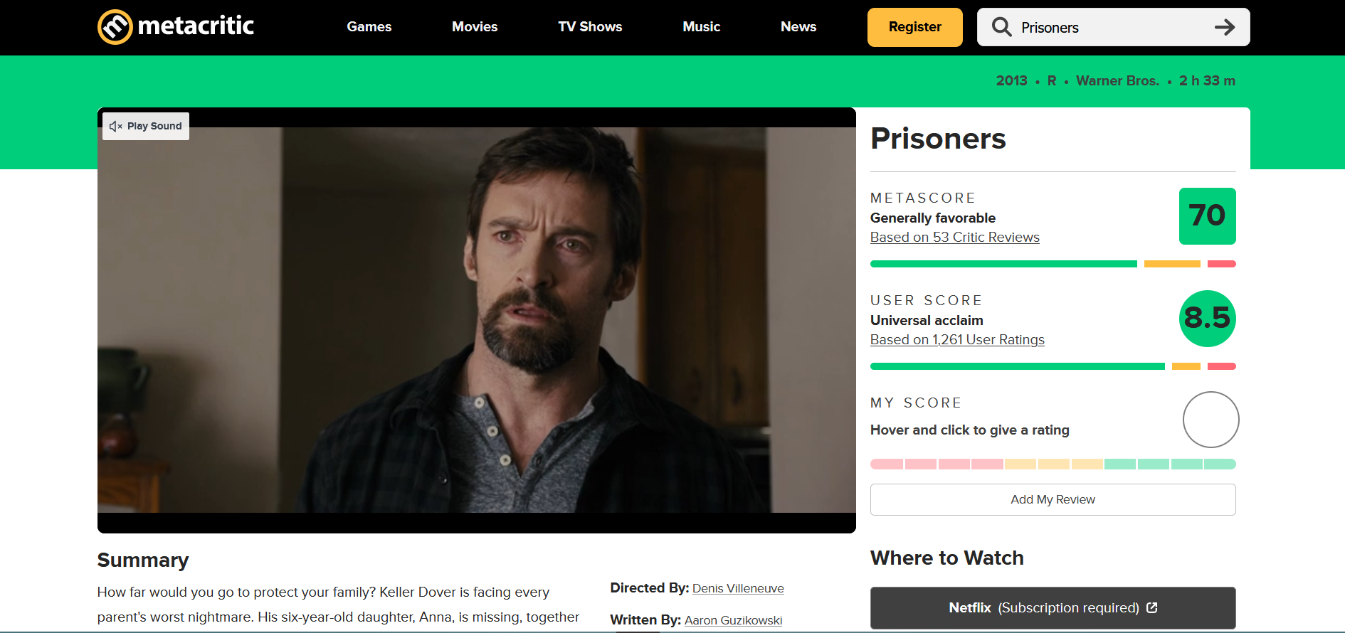


Film page
The selections on the website have also changed. For example, in the "best games of all time" rating, games are now displayed in a three-in-a-row pattern, and the ratings are located at the bottom instead of the side. However, it is worth noting that there are no new selections on the site.
Source: metacritic